Introduction
Being an expert in your field is not enough. You must communicate your knowledge and findings effectively. Although natural aptitude varies, communication skills can be studied, practiced, and refined like any other. You need only apply yourself.
Suppose you’re to give a PowerPoint talk, perhaps describing some research results in an upcoming conference. Here’s how you can do a great job…
State The Obvious
Communication is the art of stating the obvious. Isn’t that a waste of time? No, and here’s why: it’s only obvious to you, not to your audience. To communicate well, you must put aside years — perhaps decades — of study and experience, and imagine what it must be like to not know what you know.
Let me illustrate. Next time you go to a convention, stand in front of the booth of a company that you’re not familiar with, and in three seconds — without help — state what they are selling. You don’t have to be precise, but generally what is their product?
Often you will be left guessing. The booth designers were so immersed in details and commercial spin that they forget to tell you the most critical thing. They didn’t put themselves in the place of the typical conventioneer. To them, the product was obvious.
Content
Know your message. In a few short simple sentences, write down:
- What the problem is.
- Why it’s important.
- How others have tried to solve it.
- How you tried to solve it.
- Why you took this approach.
- What your results were.
- What you learned from the attempt.
- What should be addressed in the future.
Then build a presentation which says that with utter clarity.
Know your audience. What does the typical audience member likely know and likely not know? What do you want them to come away with? Tailor your talk accordingly. A presentation to management, for example, will normally be different than one to technical experts, even on the same topic.
Everyone in the audience should learn something. The audience will usually be a mix of people ranging from novices to experts. Your main points should be clear to all, even if parts of the talk go over some people’s heads. Consider including a short friendly tutorial explaining a central idea.
Begin your talk by telling people why they should care. In one or two slides, show an example of the problem, state why it’s important, and show an example of your solution. This will whet the audience’s appetite to hear more. A talk is not an Agatha Christie novel; you’re allowed to give away the ending.
Give insight. Don’t just throw technical details at your audience. Explain in simple terms what the crux of the problem is and how your solution addresses it. This will make you both a better communicator and a better researcher.
State your points explicitly throughout the talk. When displaying data, for example, tell your audience what to conclude from it before moving on. Do not assume that they will glean your points from the mass of information you throw at them. Most won’t.
Be a scientist. Are you trying to promote your ideas as persuasively as possible, or as honestly and objectively as possible? In short, are you a lawyer or a scientist? Choose the latter. Be candid about both strengths and weaknesses.
State what ideas are original. Give proper credit for past work, and just as importantly make it clear what parts are new.
Slides
Keep it simple. Unless it’s a summary slide, have each slide make one point. We often overestimate the ability of others to absorb new material, especially when we are already familiar with it.
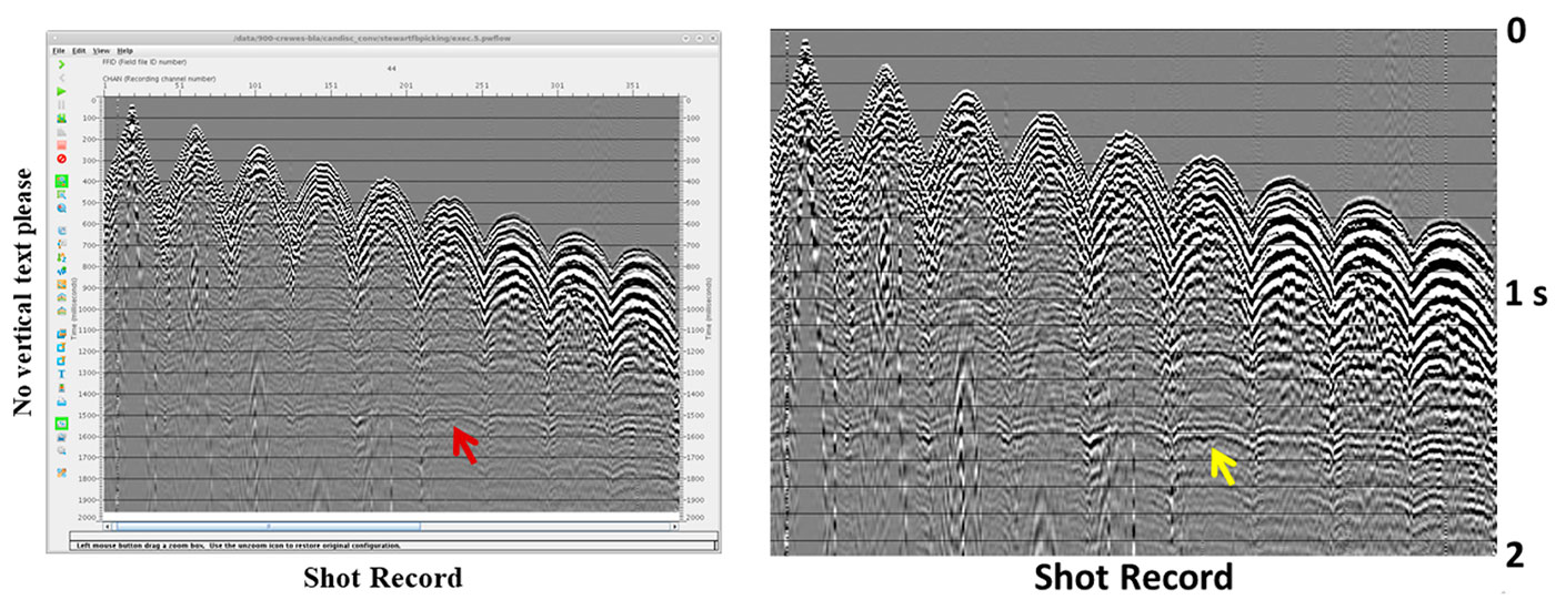
Add by subtracting. Everything on your slide must serve a purpose. If something doesn’t, remove it. Graphs and seismic sections are often cluttered by illegible annotation labeling the axes. Crop that off and replace it with legible text — or don’t replace it if the annotation serves no real purpose. Color bars are also serial offenders, most of which wouldn’t be useful even if you could read the annotation. Timing lines on seismic displays often do little except obscure the data underneath.
Everything must be legible from the back of the room. Print a slide on a 8.5 by 11 sheet of paper and stand back five feet. If you can’t see everything easily then change the slide till you can.
Dark text on a light background, unless you’re going for that 1980s look. Black on white is perfect, with perhaps blue text as a way to emphasis critical points.
Use conventional non-serif fonts. Serif fonts such as Times New Roman are fine for the printed word, but sans-serif is better on a projected image where the contrast is often poor. But ignore the font snobs and stay with conventional workhorses such as Arial, Calibri, Tahoma, or Verdana. These are highly legible and available on almost every machine.
20-point fonts or larger. If you’re using Calibri (a sound choice), make it 24. You can go one size smaller for the numbers alongside a graph, and for the slide number in the corner. Anything less and people in the back of the room will strain to read it.
The slide design is right when people don’t notice it. Don’t let the medium distract from the message. If you ask a test audience after your presentation what they thought of the font and background, and they reply “What font and background?”, then you nailed it.
Ditch the “Outline” slide, especially in a standard 20-minute talk. Spend that precious time on something useful. The Outline slide contains little the audience can’t already guess and bores them right out of the gate, a moment you should be using to pique their interest. If you must have one, display it after you’ve told them why they should care about your talk.
Communicate through pictures. Text and equations should never dominate.
Don’t be wordy. Keep text to a minimum by using brief phrases and sentences. Avoid paragraphs entirely.
Avoid complicated equations. Even expert audience members will need time to parse them. Leave most equations for the written abstract, where people can study them at leisure. If you must have equations in the talk, keep them simple. For example, don’t show the formula for a Fourier transform: a cursive Ƒ will do. Above all, don’t make understanding the talk dependent on understanding the equations.
Show at least one slide per minute, and perhaps even one every 40 seconds. Having a slide up for a long time tends to bore people and encourages over-complicated slides. Many slides, most of them simple and making a single point, are more interesting.
Preparation
Practice, practice, practice, starting at least a few weeks before. I don’t care how good of a speaker you are, you need to practice.
Prepare a slightly shorter talk. If you have 20 minutes to speak, build an 18-minute presentation. That way you won’t feel rushed, and you allow for minor technical delays. You have timed your talk, right?
Try out your talk on your fellow employees, or anyone else you can rope in. Number each slide in one of the corners so that they can take notes and give withering criticisms helpful suggestions at the end. Do your first run-through well before the actual talk so that you have time to make significant changes if necessary.
Answer questions at the end of the run-through. This gives you practice handling questions, and may indicate points you missed or could have made clearer.
Anticipate what questions may arise. Think of responses for them so that you won’t be caught off guard.
Delivery
Face the audience. You’re giving a talk to the audience, not the screen. If you must also look at the screen because you lack a monitor then, well, do the best you can.
Talk, don’t read. Some people can read a presentation without it sounding formal and stilted. Most of us can’t. Put away the notes and talk to your audience.
Speak loudly. Project your voice. Listen for it echoing off of the back of the room. If your voice sounds normal to you, that’s probably not happening.
Speak slowly. You are familiar with the topic, but most of your audience are not. They need time to absorb what you are saying.
Remove the ums and uhs from your speech, even in casual conversation. It just takes practice. You might never do it perfectly, but if you can remove most of them it will be a huge improvement.
Show enthusiasm. If you don’t find your topic interesting, why should your audience?
Ask rhetorical questions. Nothing wakes people up and makes them think like asking a question. This should mark pivotal points in the talk, focusing the audience’s attention on key issues. But don’t overuse this device, and be sure to answer the question, even if it’s “I’m not sure”.
A few jokes are fine if they are non-political and in good taste. It can lighten up a long, demanding technical session.
Use a laser pointer sparingly. In particular, don’t wave it around like you’re a Jedi Knight. Lay it down (if possible) when not in use.
If there’s a chairperson, don’t ask the audience if they have questions. That’s the chair’s job. There might not be time.
Repeat questions from the audience. People often can’t hear audience questions well, especially if asked without a microphone. Repeating a question before answering it ensures that you’ve got the question right, and that everyone knows what you’re addressing.
Don’t be afraid to say “I don’t know”, both during your talk and when answering questions. No one is omniscient, and it’s a mistake to pretend to be.
Finally…
Continually improve. Regularly practice your public speaking. Read books on communicating, such as those listed below. Assess other people’s talks. What worked? What didn’t?
The best speakers are not those who dazzle you with their brilliance, but who make complex matters clear. The greatest compliment is this: "I like your talks. I always learn something".
The above article is copyrighted by Juniper Bay Software Ltd. under the Creative Commons Attribution 4.0 International Public License. Briefly, this means you are free to distribute, remix, adapt, and build upon this work, even commercially, as long as you credit the author for the original creation.


Join the Conversation
Interested in starting, or contributing to a conversation about an article or issue of the RECORDER? Join our CSEG LinkedIn Group.
Share This Article