Introduction
The job of a petroleum geoscientist is rapidly transforming into a role that requires proficiency with statistical concepts and data management. The goal of this primer is to provide the reader, through words, basic examples and images, an understanding of some of the basic principles behind the semivariogram/variogram, a statistical tool, that geoscientists can use to understand how their spatial data is changing over distance. Blending mathematics and statistics into the world of geoscience is an area where many have difficulty and shy away from. For a period of time, this was the case with me. Therefore, my aim is to make understanding these principles as visual as possible, while demonstrating key concepts, so that as you work through the mathematical components of the semivariogram/variogram, you have a firm bedrock of relatable real-world ideas and a step by step visual representation of the thought processes involved.
The First Law of Geography according to Waldo Tobler is,
"Everything is related to everything else,
but near things are more related than distant things."
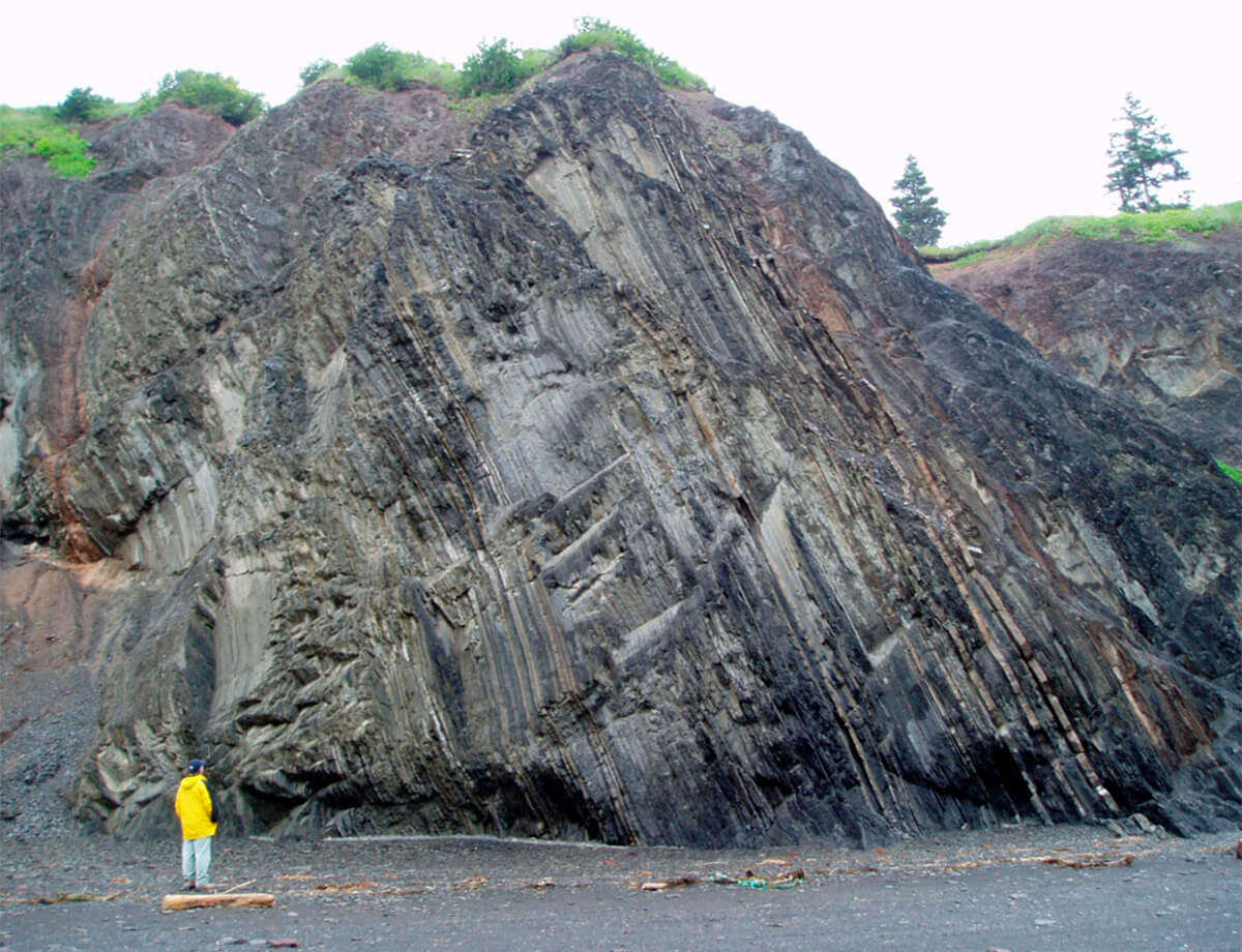
Close your eyes and think of the last outcrop you visited (e.g., Fig. 1). Do any of the following gross conceptualizations (Fig. 2) ring true to you?
The concept of spatial continuity flows from Tobler’s First law. Spatial continuity, in simplest terms, is the measure of correlation of a property over some distance.
Homogenous = High Spatial Continuity
Heterogeneous = Low Spatial Continuity
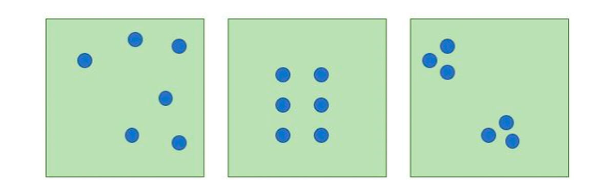
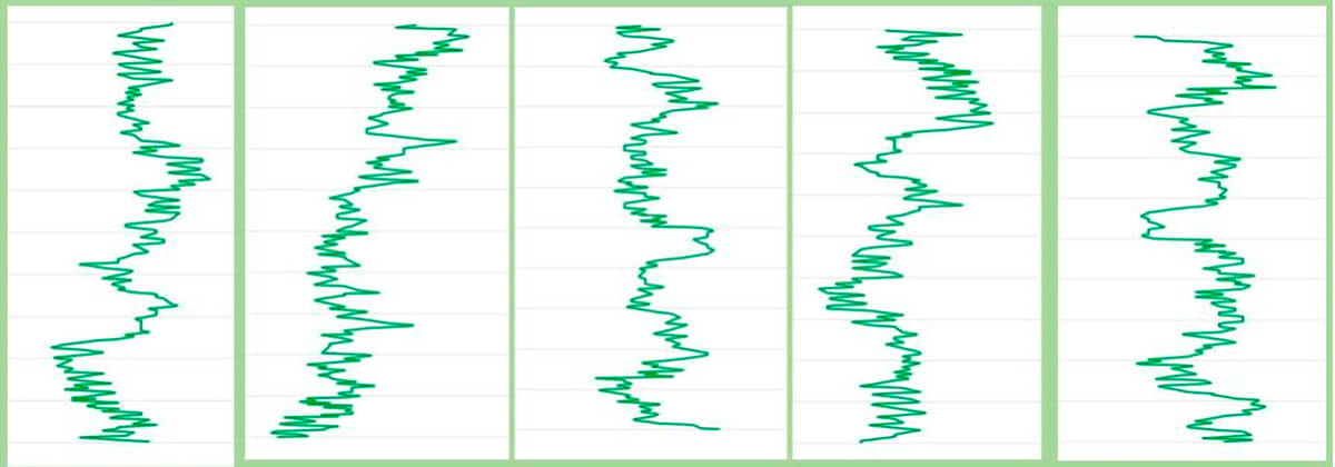
There are also other aspects to consider. In Figure 2, we have three series of data arranged in random, uniform and clustered patterns. How your data is arranged in real life will rarely be uniform and will strongly affect how you employ and construct your statistical models.
The images in Figure 3 demonstrate different aspects of spatial continuity, with that on the left demonstrating a lower spatial continuity than the one on the right. Note that you will see the image on the left again, when we talk about variogram models.
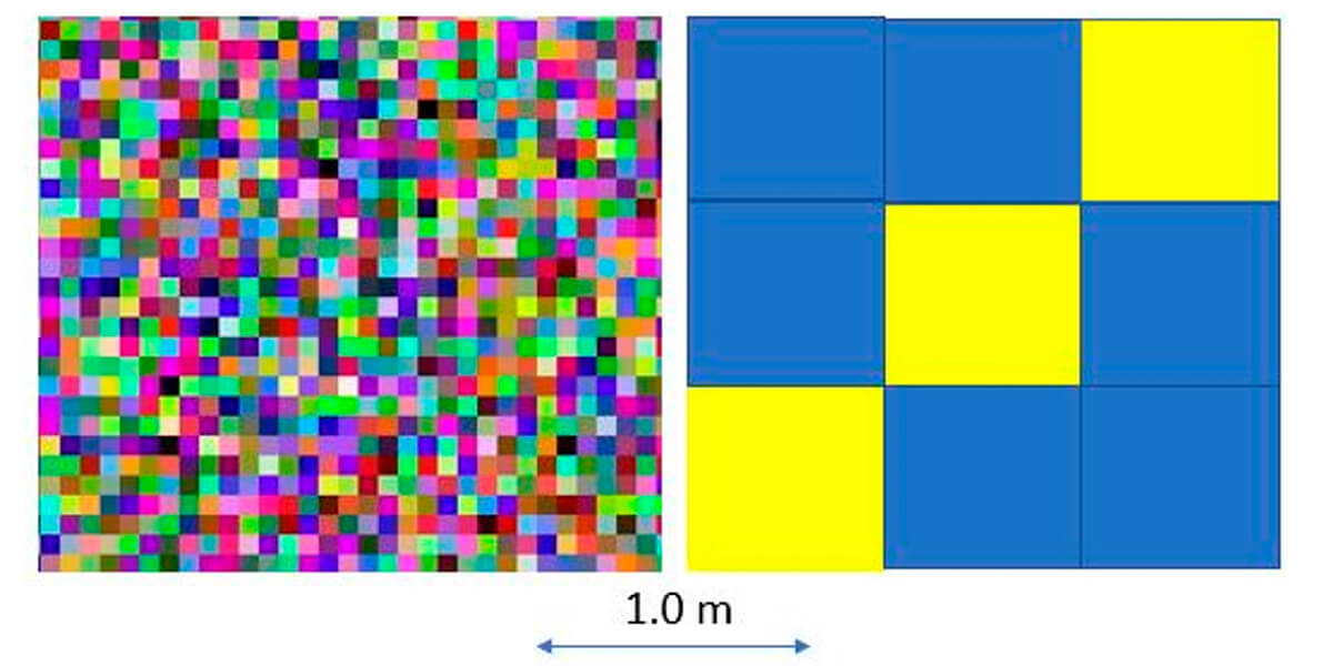
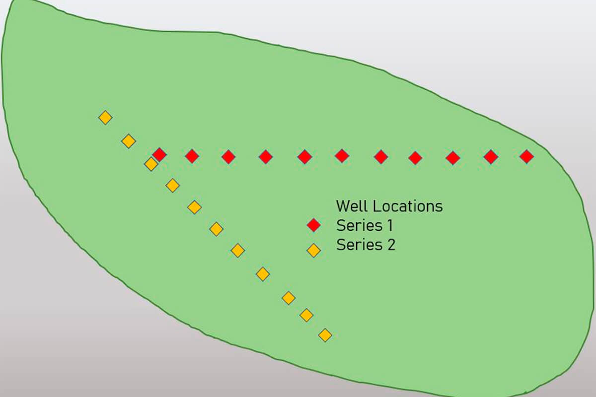
Figure 4 is a simple map of oil and gas well locations near the city of Leduc, Alberta, Canada. Note the heterogeneity on the large scale. This does not imply that there is no homogeneity to be found. That is dependent on the parameters set for your investigation. Think back to Figure 3 and how, for example, the size of the pixels could change your perception of spatial continuity.
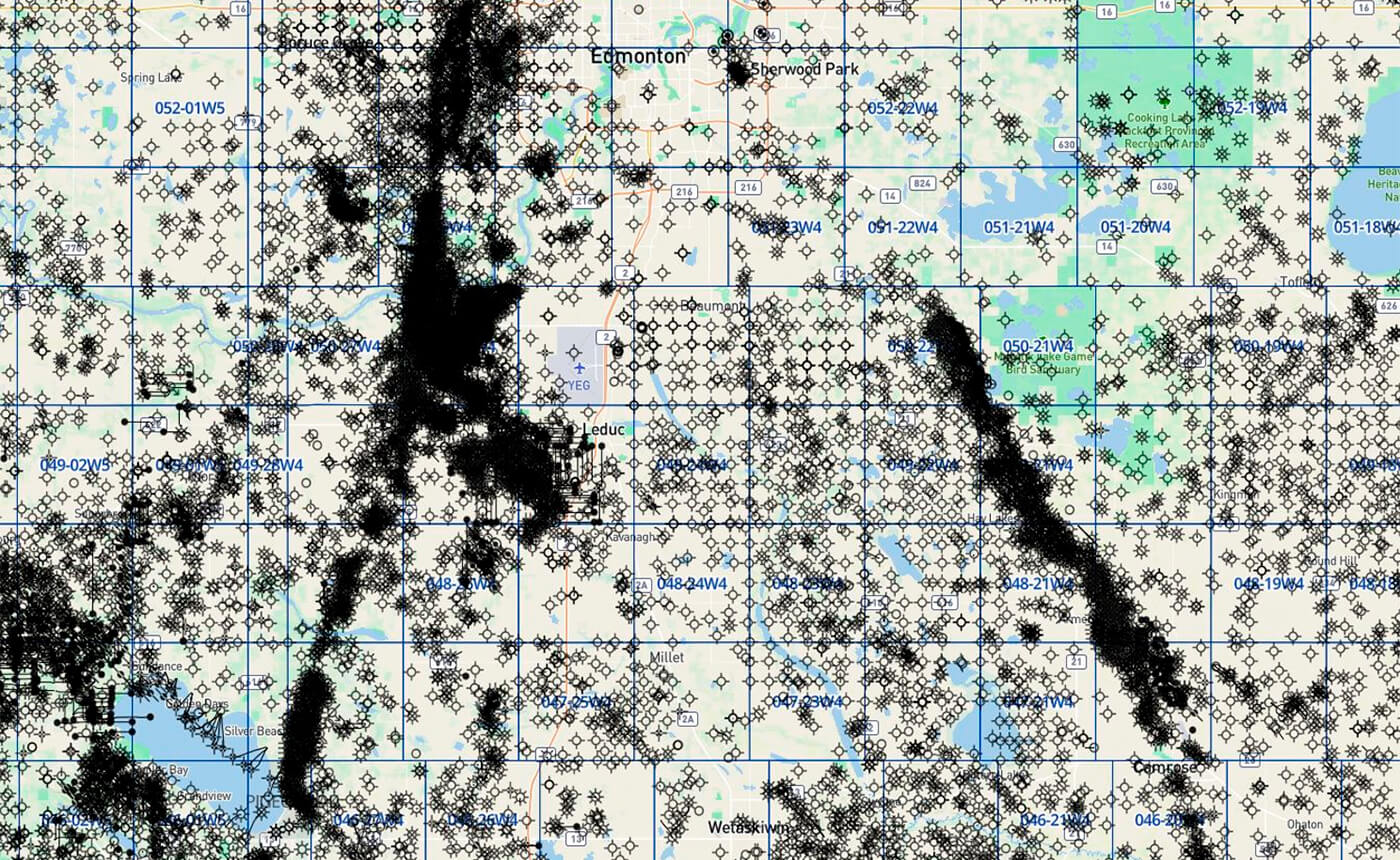
At first, when conceptualizing the complexity in Figure 4, quantifying and modeling the variability that we see, like spatial continuity, may seem like a near impossible task.
As Figure 4 suggests, the properties in the subsurface that are important to us as petroleum geoscientists are highly heterogeneous and change over relatively short distances. We see a mix of data arrangements, some appearing random, clustered, and even ordered. The arrangement of the data is something important to note and consider, since it may tell us something about what we are trying to estimate.
It is for this reason that it is important to have a good understanding about how to quantify spatial continuity, then correctly put this continuity data into a model that will tell us something useful and aid our decision-making.
On the most basic level, filling in the gaps of knowledge and data requires some perception and methodology, to determine the nature and degree to which data points are similar, or dissimilar, in space.
As with most things, it is best to start simple and work slowly towards more complexity.
NOTE: Before moving forward, it is important to understand that the images and figures have been constructed to convey basic concepts - not exact plotting or calculations of real data.
Simplified Example
Let’s start with a simple situation.
Figure 5 illustrates a fictional area of land we want to investigate. We have well data that is (conveniently) calibrated logs arranged at 1 km intervals. As luck would have it, these wells seem to be arranged in straight lines, albeit trending in different directions.
You are tasked with assessing the net sand in a reservoir. There is no money in the budget to acquire additional seismic, and your boss would like to know the feasibility of placing new wells between these two series of wells, labeled Series 1 and Series 2 (Fig. 5).
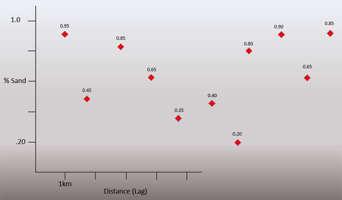
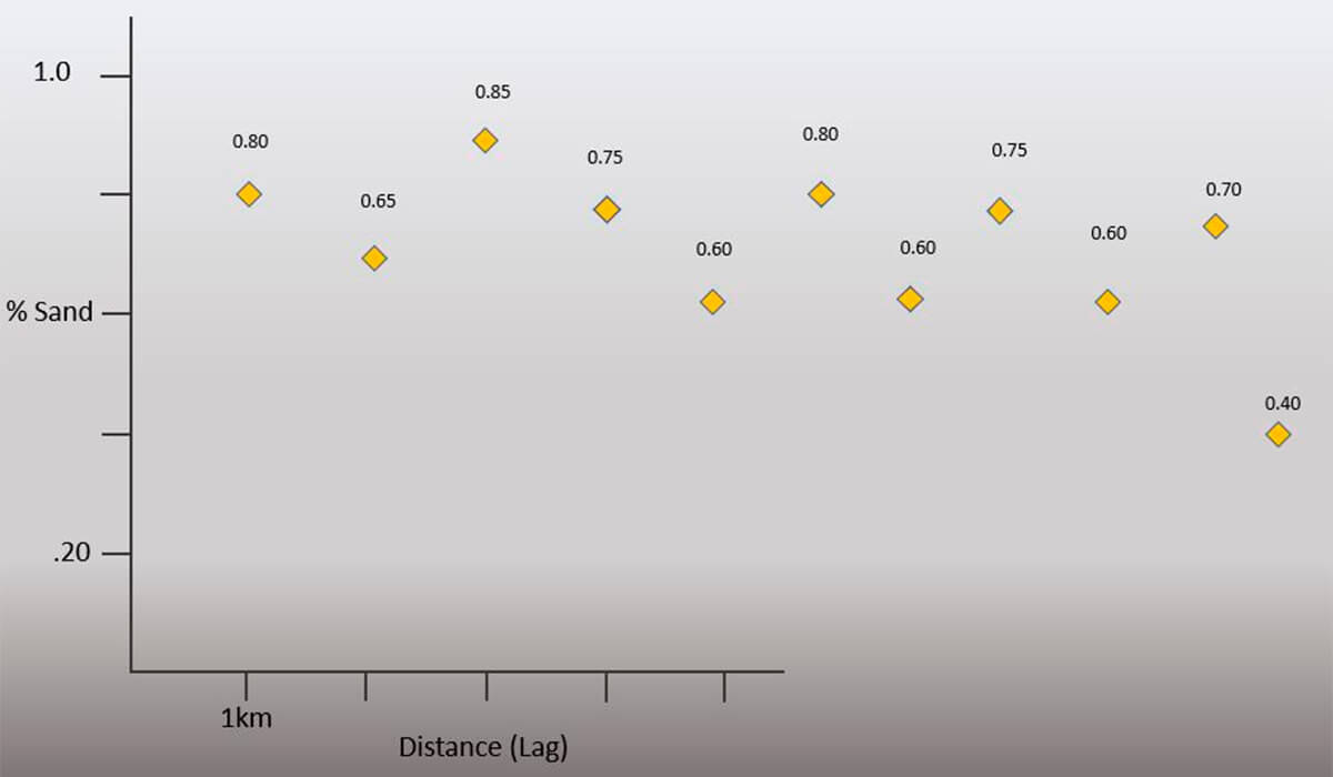
Knowing and being able to quantify the spatial continuity of the net sand values away from your wells is possible, but requires some understanding of the available statistical tools, and their limitations. You decide to do some petrophysical analysis of the selected wells (Fig. 6) and determine some net sand values for each. You follow up by plotting your calculated values and notice that there is indeed a difference and something like a trend present.
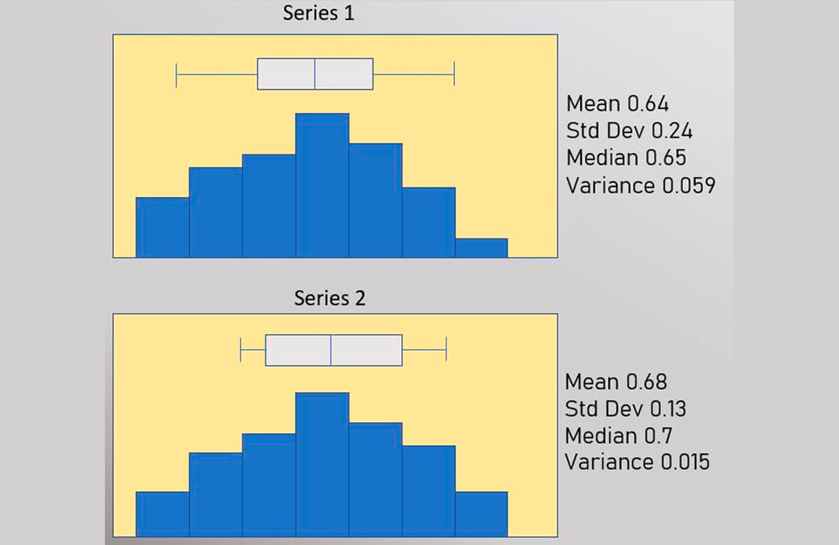
From the plots of your net sand vs. distance (Figs. 7-8), you can see some significant differences between the two series. You want to quantify this, and thus decide to run some basic statistics you learned on the data you have collected (Fig. 9).
NOTE: One of the reasons univariate statistics limits our ability to understand the nature of spatial continuity is that estimations like the mean (average) are notoriously sensitive to outliers. This problem does not go away with the calculation of a semivariogram value. In fact, it is even more sensitive to outliers in the data. Understanding the nature of data outliers is essential in geostatistics and will be covered in a follow-up paper.
However, the univariate statistics most people remember from their high school math class, (Fig. 9) do not show a major difference, and they certainly don’t convey much useful information with regard to understanding the differences between the two series over distance. As the name suggests, univariate statistics are a statistical analysis of the data that includes a single dependent variable.
What are needed are other statistical tools to help understand the variation in 2D space between data points at all distances.
Separation Vectors and Lag Distance
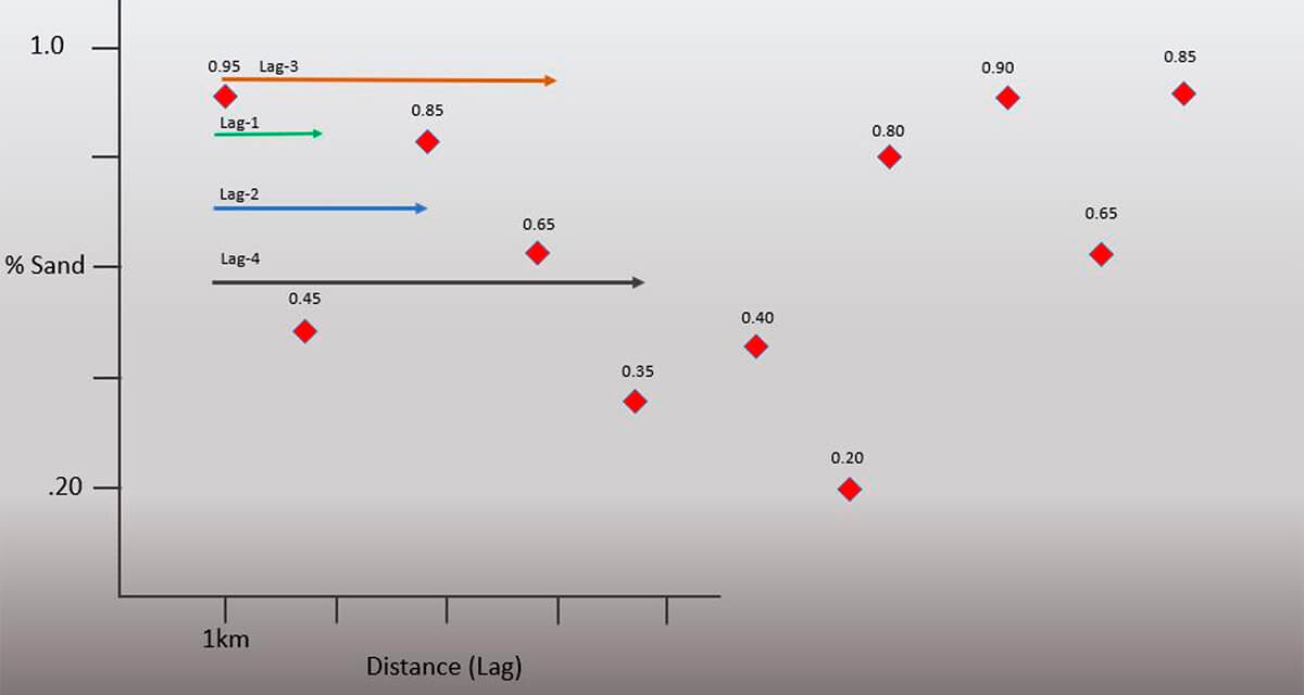
An essential component in our understanding of the semi-variogram is the concept of a Separation Vector. Presented below (Fig. 10) is the graph created for the second series of well log data (Fig. 8). The green arrows included on the Figure 10 net sand plot are known as separation vectors. This vector informs us of the direction and distance for our selected sample pairs.
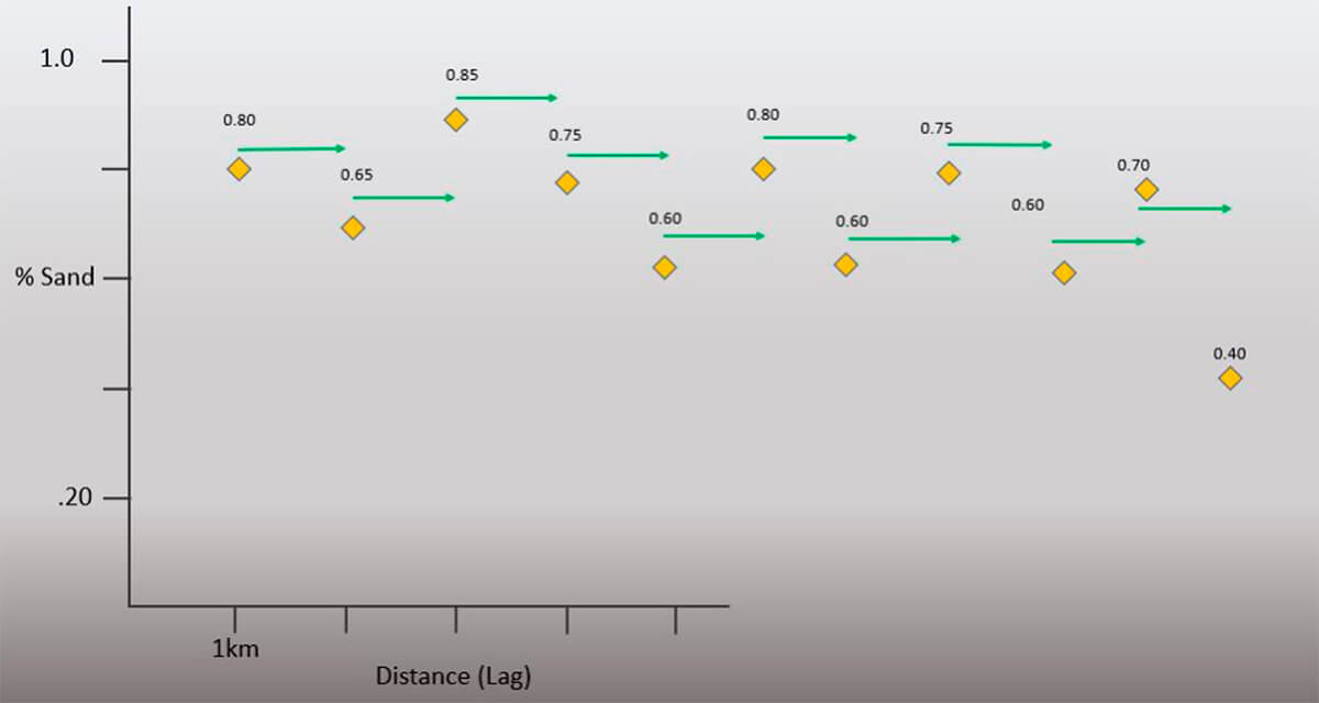
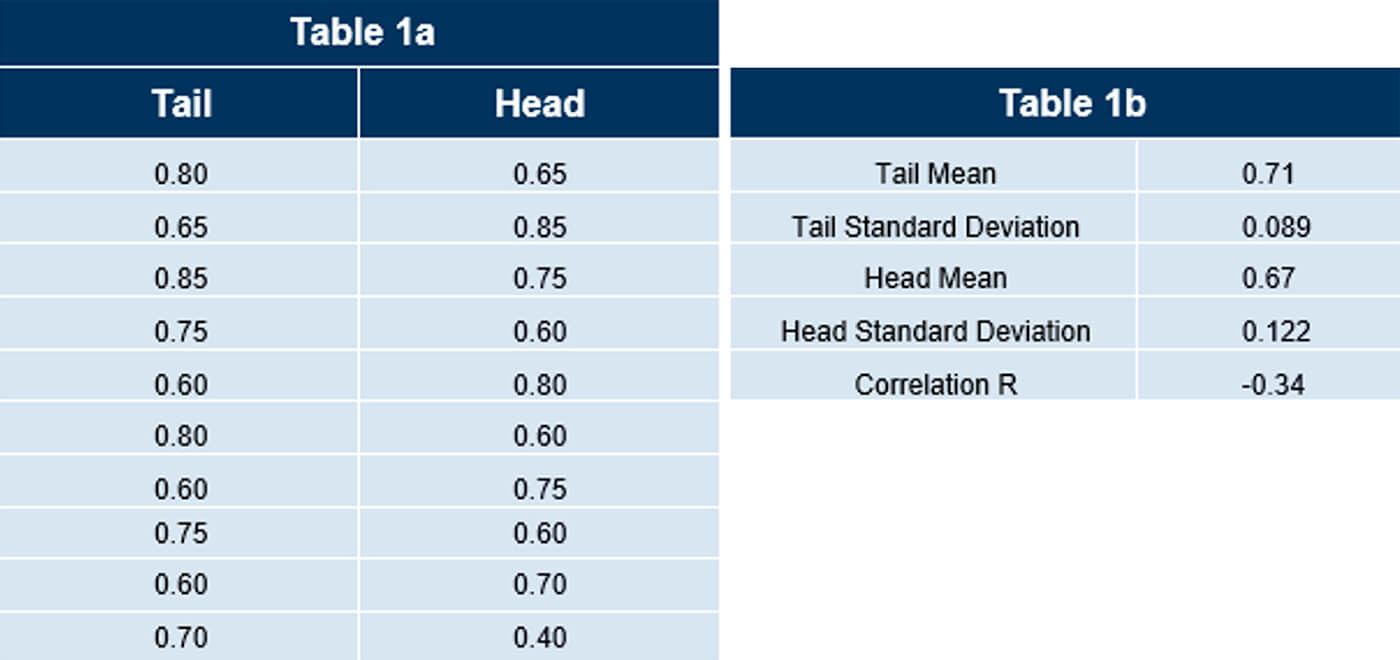
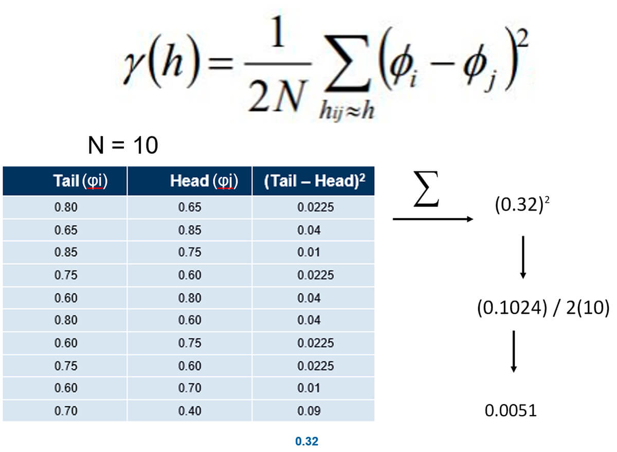
There are a few things to note right away. The length of the vector is 1 km and is measured from tail to head. This is known as the lag distance. As a result, each vector references two values, with Table 1a listing these vector values and their arrangement.
This is often referred to as collecting Lag (n) statistics. Lags have different lengths as shown above with (n) defining a lag of a certain length.
Table 1b lists statistics calculated from the data collected and displayed in table 1a. Note the negative value of the correlation coefficient R.
In Figure 11, the green arrows are now calculating the Lag 2 statistics. These Lag 2 vectors are now 2 km in length. You can see the values collected and statistics in Tables 2a and 2b.
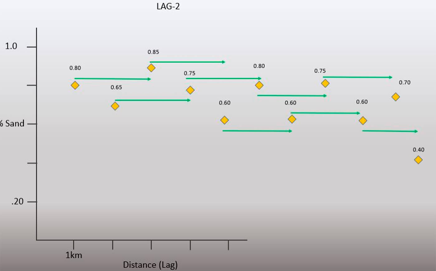
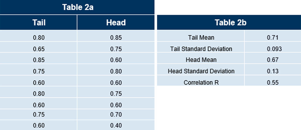
Note the difference in correlation coefficient compared to Lag 1. Instead of a negative R it is now positive. Look at the relationship between the lag pairs in both examples and see if you can figure out why. Also note that we have nine sets of lag pairs versus the previous ten.
In normal practice, you would tabulate multiple lag values for each series as is shown below.
For brevity, Figure 12, shows the different lag vector lengths for the other data series. Depending on the distance involved and the size of the data set you are working with, you may feel it necessary to calculate many more sets of lag statistics.
The take-away here is that any series you work with will require many tabulations for many different lag lengths.
There are a few things to note about this series. Observe the higher degree of variability in the net (%) sand value. At this point you may see that from visual inspection correlation seems to have a relationship with the Lag(n) length.
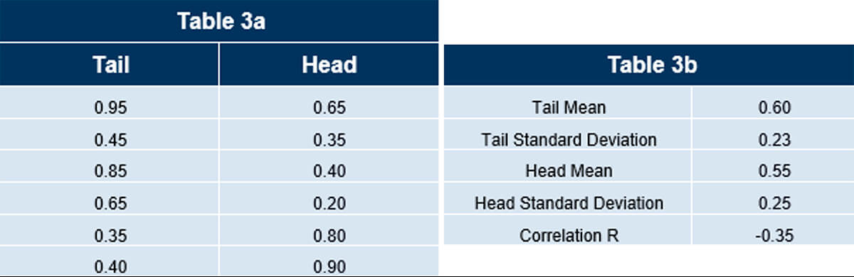
Tables 3a and 3b show the calculated statistics for Lag 3. These statistics don’t tell the whole story and can be misleading, especially as the lag value goes up. With small data sets, large lag values begin to lose their statistical significance. A simple reason is that there are too few pairs of data and are measuring properties “around the edges” of the data set, leaving out all the useful data in between.
Correlogram
Now that we have introduced the basics of separation vectors, let’s take it a little further.
For learning purposes, let’s suppose we performed the same procedure on some different and larger data sets.
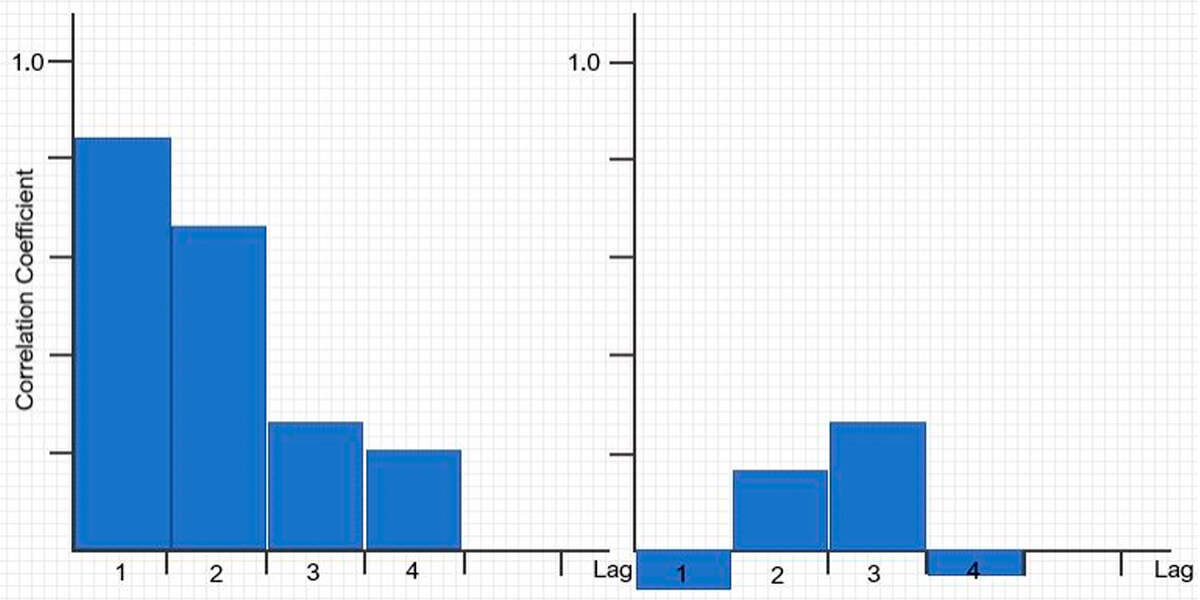
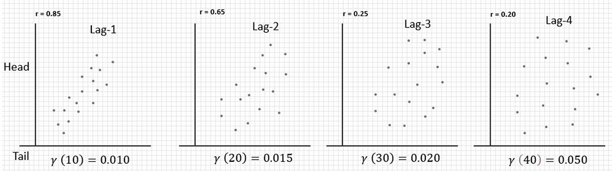
In Figure 13, we can see two data series with different lag vector sample pairs collected and arranged in scatter plots. The correlation coefficients calculated are in the upper-left corner.
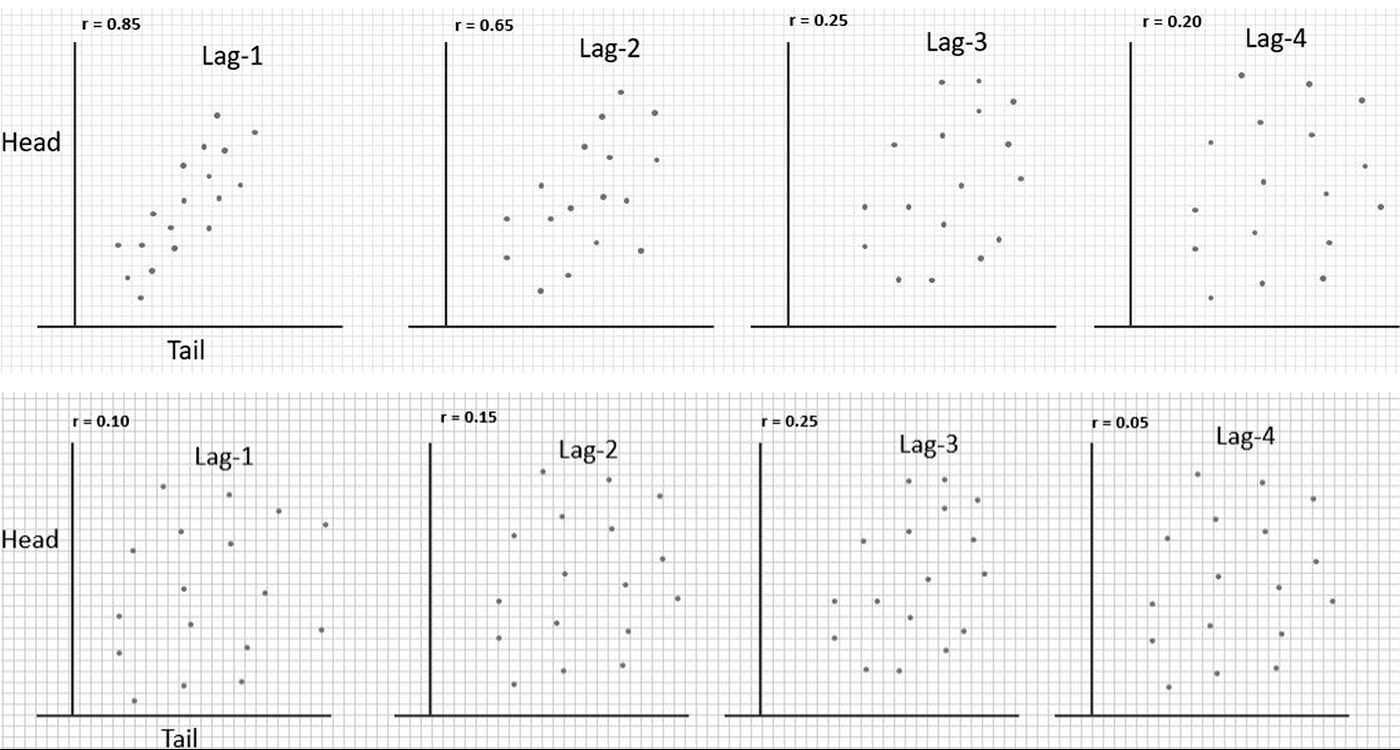
The fundamental take-away for the top series of data is rather simple; that when the distance between pairs, Lag (n) increases, the correlation between samples decreases. The bottom series is a visual illustration of a data series that shows little correlation and no real trend. Some of the correlation coefficients are even negative.
Figure 14 shows a plot of the covariance values, from which we calculate the correlation coefficients, versus lag distance. This is known as the correlogram. It is easy to see that the two sets of samples are not the same. We have some visual evidence now to see how much correlation is a function of separation distance between samples.
Semivariogram
The correlogram is useful but doesn’t provide enough detail for useful decision making. To get closer to our goal of understanding the semivariogram, let’s take some data and arrange some lag pairs on a scatter plot as before (Fig. 15). Note as in the other scatter plots, these data points represent the sample pairs of data for one particular lag value (n).
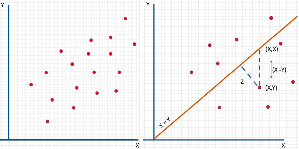
The orange line in Figure 15 is at 45 degrees where X = Y. This implies perfect correlation with the head and tail values being equal. So, we can use that to calculate something useful about a relationship for this set of lag pairs. For our semivariogram, we need to calculate the average squared distance from each point to our orange line X = Y. This is represented by the blue dashed line Z. Figure 16 below shows the equation for the semivariogram. Quickly note, φi references the tail value, and φj references the head value of two data points collected from a specific Lag(n) distance; see Figure 18 if this is still unclear.
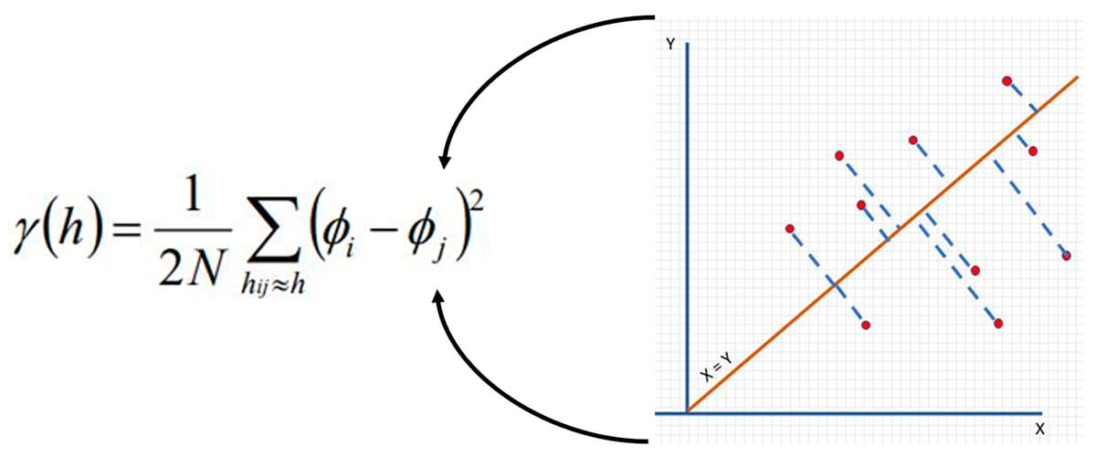
The semivariance at lag distance h = 1 / 2 * (number of pairs) * the summation of the squared difference of the sample values of tail (φi) - head (φj) of the separation vector for distance (h) (φi - φj). If reading this is confusing and hard to understand, don’t worry it is laid out for you below.
Figure 17 shows the relationship between the correlation coefficient and the semivariance. Note as the semivariance (γ) value increases as the correlation (r) decreases.
In this case, we can say that there is a greater degree of dissimilarity as the distance increases. Note that there is a single variogram for a single lag distance.
MORE NOTES! - The terms variogram and semivariogram are often used interchangeably. There is a difference! The variogram is the correct term when you remove the 1/2 factor. This 1/2 factor is used so the variogram and covariance function can be directly compared.
If you followed this far, well done! You now have calculated a semivariogram value for the given lag value (Fig. 18).
Using the function described previously, the value for the semivariogram calculation can be plotted on a graph. We call this our experimental semivariogram.
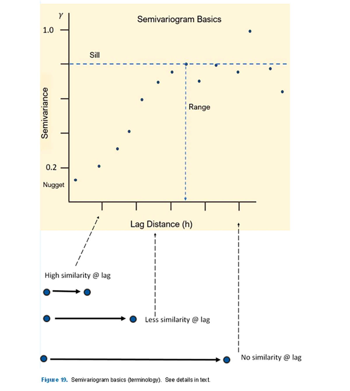
We can plot these differences (y-axis) versus lag (h) (x-axis). Note each calculation for a given lag (h) over the entire data series will generate a single data point to plot. Such a plot (Fig. 19) illustrates several interesting observations and terminology:
Sill – Perhaps the most important feature of the semivariogram. It represents the semivariance value where spatial correlation is no longer present. The value of the sill is estimated at the point where the experimental variogram stops increasing.
Range – The range is the lag distance that corresponds to the value of the sill. Beyond this point there is no correlation. In layman terms, this is the distance when the properties measured in the data stop having similarity.
Nugget – One would expect at a lag of 0 for there to be perfect correlation, e.g., a sample versus itself. However, due to measurement or sampling error, and short scale variability below the scale of measurement, this can cause it to be non-zero.
Again, note can also see the relationship that exists between the scatter plot of our lag pairs and the single variogram value calculated from them (Fig. 20).
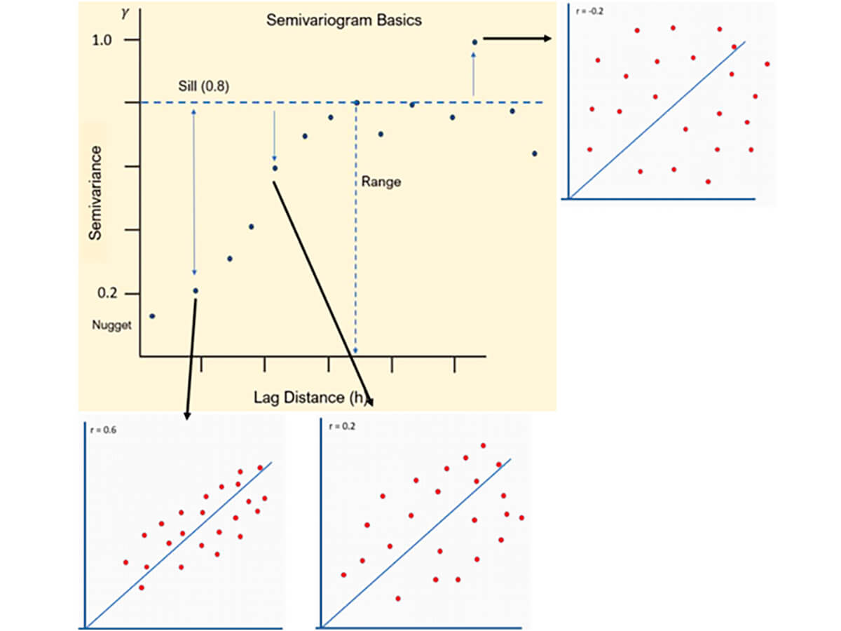
As may be expected at this point, the tightest correlation has the lowest semivariance, which grows as the lag distance grows until the point past the sill, where there is no apparent correlation.
Note also the value of the correlation coefficient in the scatter plot. The correlation coefficient at the lag distance is equal to the value of the sill, e.g. (0.8) - the maximum value of the semivariance.
Geometric Anisotropy
Geometric Anisotropy is a critical component to understand how to model and interpret a variogram. With regard to most geological processes we may be interest ed in, spatial continuity depends on direction, especially when dealing with anisotropic features, such as a channel, that have much higher correlations along the channel than across it. In order to understand and be able to make decisions about spatial continuity, we need to quantify and visualize it. Many geologic features have geometric anisotropy.
In Figure 21, to the left, is a data set with the semivariance values presented in a heat flow map. The two lines represent the directions of the lag samples starting at the origin. There are, in essence, two directions: a major and a minor direction of continuity. A useful place to start is by extending the major line in the direction of greater continuity, in this case 50o, then placing the minor line orthogonal 90° to it.
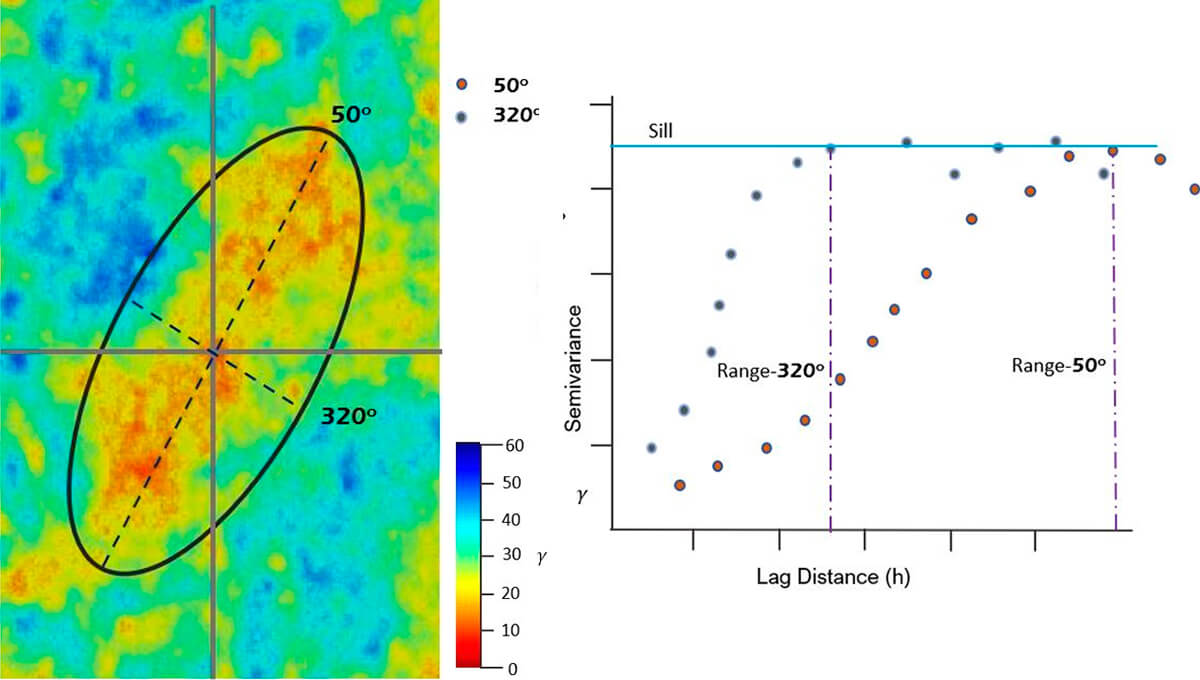
To the right in Figure 21, we have created an experimental semivariogram of that data. Notice the shape and trend of the line. You can see that for the major line, the continuity goes further than the minor line. In other words, it reaches the sill at a greater distance (h).
The question that may be in your mind is, okay then, so what is the purpose of the ellipse? The ellipse in this case (Fig. 21) represents the range of the variogram in the direction of the major and minor lines of continuity. It becomes a useful model for geometric anisotropy.
It is important to note that the geometric anisotropy may (in all likelihood) change with the scale of your investigation. This occurs even when you are sampling a similar physical property albeit at smaller intervals.
When thinking about geometric anisotropy, it is helpful to think about the relationship between the samples as they get further and further separated. A variable like porosity tends to have a trend or structure imparted during the deposition and diagenetic history.
Cyclicity
Being a clever geoscientist, you note that geology matters in 3D both in the horizontal and vertical directions. In fact, you are rather sure that more variation is present in the vertical direction than the horizontal. Look at Figure 22, an image of modeled porosity. The black arrows indicate direction of sampling.
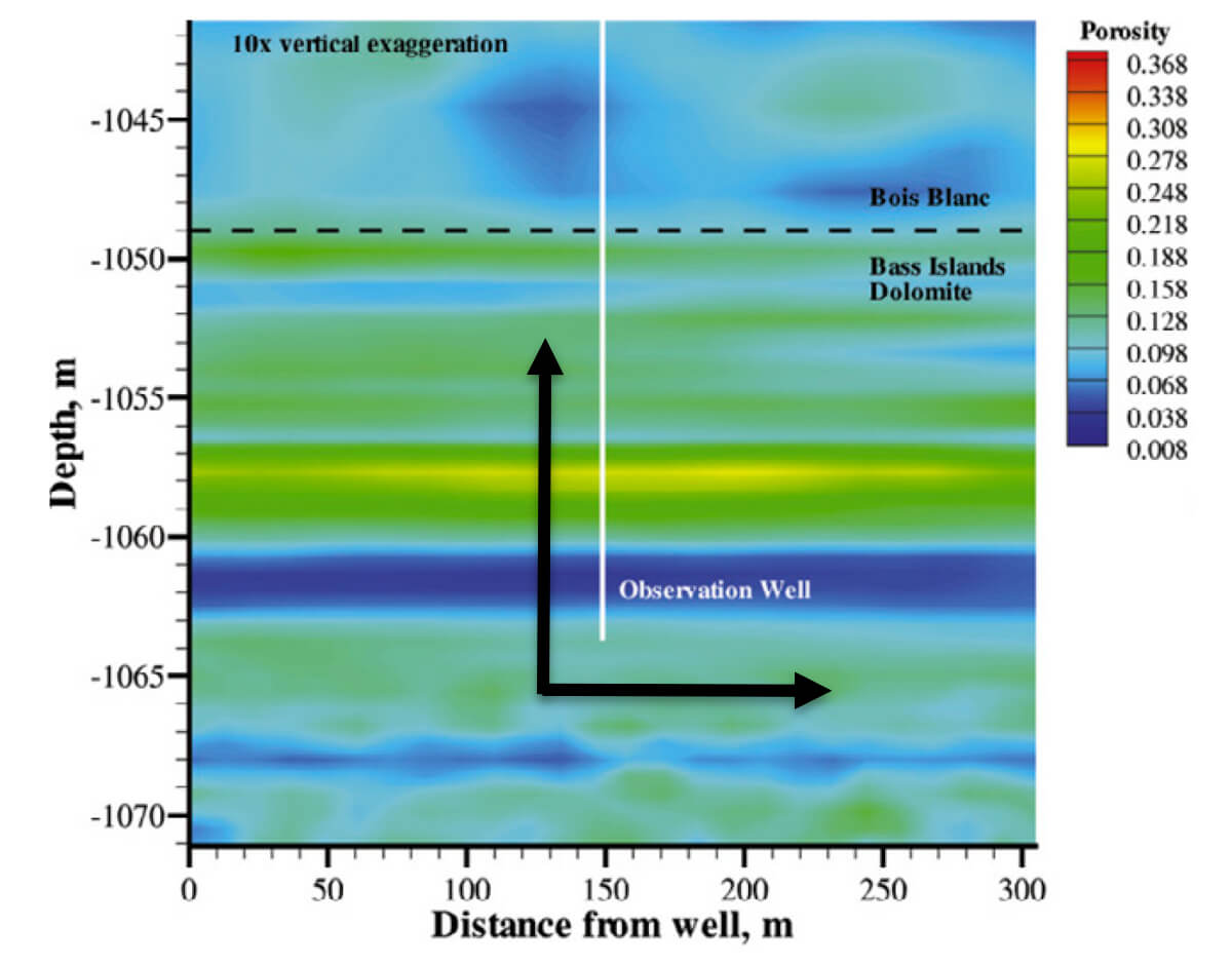
The take-away is to observe the shorter range, and the cyclic repeating nature of the semivariance in the vertical direction (Fig. 23).
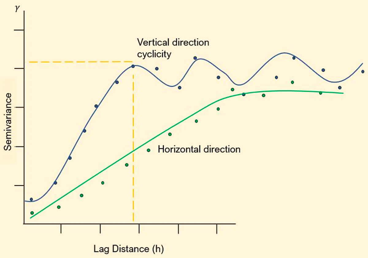
This cyclic nature may be related to periodicity in deposition or another phenomenon. It could be an artifact of the data, noise, or a function of decreasing data frequency or quality. There should be a degree of spatial correlation for a physical process. This structure should be apparent in your semivariogram. Differentiating between noise and structure takes practice and attention paid to the known spatial continuity of processes influencing the distribution of your physical properties. Refer back to the well map on the second page. Your intuition regarding a geological process influencing well distribution is probably spot on. (Tip: Think Devonian)
It is important to realize that the semivariogram informs our understanding. It does not stand alone and like everything else in geoscience is one tool to be used with others to create a fuller understanding of the subsurface.
More Realistic Example
Up to this point the examples given have been for rather linear evenly spaced data points. Data in the real world (especially in the world of petroleum geoscience) is rarely arranged in such a manner. The question then becomes, how do we construct a variogram with sparse, irregularly spaced or clustered data? How do we construct the parameters for such a model?
Extending the thinking further, how do we deal with irregularly spaced data? Where do we go with the semivariogram? Does it play a role in other methods of data estimation and visualization?
Figure 24 shows a more realistic representation of irregular data dispersion. Until this point, the examples we have been working with have been largely linear and regularly spaced. There is a method available for calculating an exponential semivariogram when you have data dispersed in a more irregular and random manner.
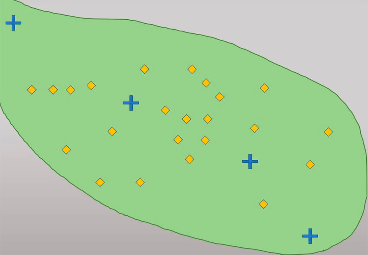
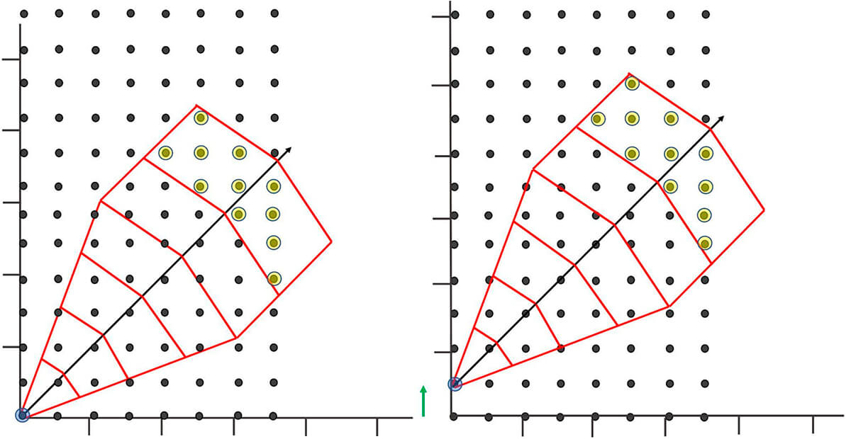
Figure 25 shows an example of a template that can be used to gather lag pairs of data. This template will allow for ordered and systemic grouping of lag pairs with a clear logic behind how the parameters are selected.
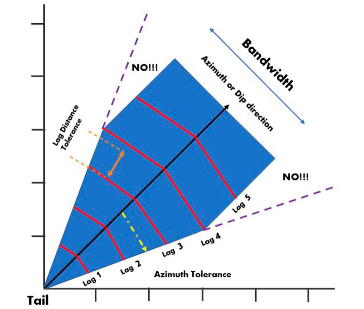
Our goal is to create something like a net that can capture the data we want and that will give us reasonable results and exclude casting our net too wide. Setting the parameters and tolerances helps us control the shape of our net so it is suitable for our use.
Azimuth or Dip Direction – This refers to the main direction of your template. Most geological phenomena have a plane of major continuity, such as a stratigraphic surface or vein of mineralization.
Azimuth or Dip Tolerance – Our azimuth tolerance allows us to catch data that doesn’t fall directly on very near our azimuth direction line. This angle sets the narrowness or width of the sample template.
Bandwidth – Note the purple lines with the text NO!!! in Figure 25, extending off the body of the sample template. Note that the template no longer continues expanding outwards based on our azimuth tolerance but retains a constant width. This constant width is called the bandwidth. We apply this tolerance to our template so that we can apply a reasonable limit to the amount of data collected off the azimuth or dip direction. This bandwidth helps us avoid casting our net too wide as our lag distance grows. An example of this would be when collecting and modeling stratigraphic data. If your net is cast too wide you will capture data from much greater depths the further from your tail value you get. The bandwidth greatly influences the reliability of your model, as heterogeneity in stratigraphy is often much greater in the vertical direction than in the horizontal.
Lag Length – The lag length or lag distance sets the distance between different lags. This can be different for different azimuth directions.
Lag Tolerance – The lag tolerance allows us to narrow down the area in a specific lag, where we will allow the collection of lag pairs. It creates a subdivision in our lag “bin”. The lag tolerance is recommended be about 0.5 of your lag spacing. If you have dense data your lag tolerance should be smaller, while if you have sparse data you may need a large lag tolerance for variogram stability.
It is important to strongly consider as much information about our data as possible, like the shape and orientation of our ellipse, so our collection parameters for the template have a consistent logic behind it, nothing meaningful is left out, and outliers, if captured, are understood.
For learning and illustration purposes we have a very well arranged and evenly spaced theoretical data set with a template overlaid (Fig. 26). Figure 26 shows how the template can be used for a given Lag(n) distance, and set of tolerances, all the possible data head values that can be compared with the tail values. The image on the right in Figure 26 shows how one would move to a new tail value (occasionally referred to as a node) and continue this process to gather information based on a specific Lag(n) and set of tolerances.
Repeating the process for all possible tail values for the lag value would give you the sample pairs needed for calculating the semivariogram value for one lag. You would then repeat for all possible lag value to construct an experimental semivariogram. This is lots of work! Thank God for Excel, SGEMS and R!
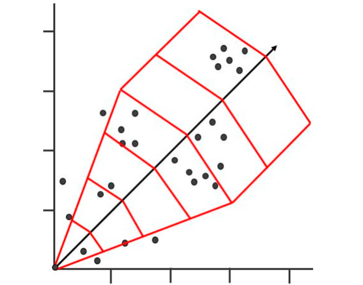
Figure 27 better demonstrates the reality of how data is more likely to be arranged in the real world. For reference we have a template arranged over it.
Note, the shape and parameters of your template will also certainly be different. It is important to play around with your parameters and check them against your experimental semivarigrams. Too much noise or no structure is a sign you need to tweak your tolerances.
Kriging
The experimental semivariogram that has been covered up until this point is useful in its own right. However, it is one part of a larger tool kit when it comes to spatial estimation.
It may be helpful to refer back to the map in Figure 24 when thinking about the template (Fig. 27). In it we have a simple visual of the type of problem that most people envision when it comes to geostatistics. We have irregularly dispersed data, and locations (designated by blue crosses) where we would like an estimation of a certain geological property of interest.
Ideally, we would want an estimator that takes into account things such as spatial continuity of the data, proximity of the data, redundancy of the data and weights we give to individual data points. In reality we would like to have an extrapolation of the property of interest over the entire area of study (Fig. 36).
Our semivariogram is a good base to build from, as it is composed of known values at a given distance and allows some prediction of a value at a random or unknown location, provided that new location is within the range. However, it is a stepping stone to a process called data kriging, which helps us map spatial continuity.
Kriging is a multistep process that allows us to create a surface map of estimates based on the spatial autocorrelation of our known values that satisfies our constraints mentioned above. Kriging can be thought of as the means to deliver a useful product from our real-world, irregularly spaced data points. Remember our goal is to make an estimation of a data value at an unsampled location using our data from our sampled locations. We also would like to have some sense on how accurate our calculated estimations are by assigning a probability to the location.
Kriging in basic terms is an estimation at an unsampled location calculated as the weighted sum of the adjacent sampled points. The weighting factors depend on a model of spatial correlation, with the calculation of the weighting factors done by minimizing the error variance of a given or assumed model of the data with regard to the spatial distribution of the observed data points. This model of spatial distribution is where the semivariogram is essential. Knowing what model to use and why depends on many factors that we will need to consider. Consider Figure 24 again. With kriging we can make an estimation for the net sand at each of the unsampled locations marked by blue crosses. With enough computing power could also create a map of high resolution, creating a “prediction surface” of modeled data (Fig. 34).
We will not cover kriging in more detail in this paper, however, it is essential to have some idea of what can be created with semivariograms and the models used in that process.
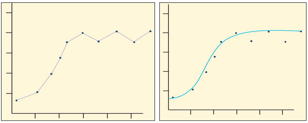
Why use a Model at all?
In Figure 28, you can see that simply connecting our data points can lead to problems, as not all of the relationships are positive (left graph). As a result, providing estimates for all directions and distances is not possible, so if we were to use this method to provide spatial autocorrelations for our kriging process, not all of our kriging variances would be positive. For this reason, we apply a model that is a continuous positive function to our experimental variogram. This variogram model can then be used for our data kriging process.
You can see this application of the variogram model on the right in Figure 28 where we plot a variogram model against the experimental data. Because our model line is continuous and positive, we are able to calculate all possible lag distances off our fitted model.
Note That no model will be a perfect fit for your data.
Data Models: Starting Off Easy
Pure Nugget Model – Note in Figure 29, the variogram is at 0 at the origin and the model value increases in the x direction. This is just pure noise and not a good estimator. However, it becomes useful when we start looking at nesting variograms in a later paper.
Linear Model – In the example in Figure 30, our model is starting at the origin (0,0). However, your data is more than likely to have a nugget effect.
Equation for linear model:

Where
S = slope
h = distance h(x) at which to calculate your variogram value.
n = nugget.
Spherical variogram model – It is important to note with this commonly used model, illustrated in Fig. 31, that the line extending from the origin meets the sill at 2/3 of the range, before it levels off at the sill.
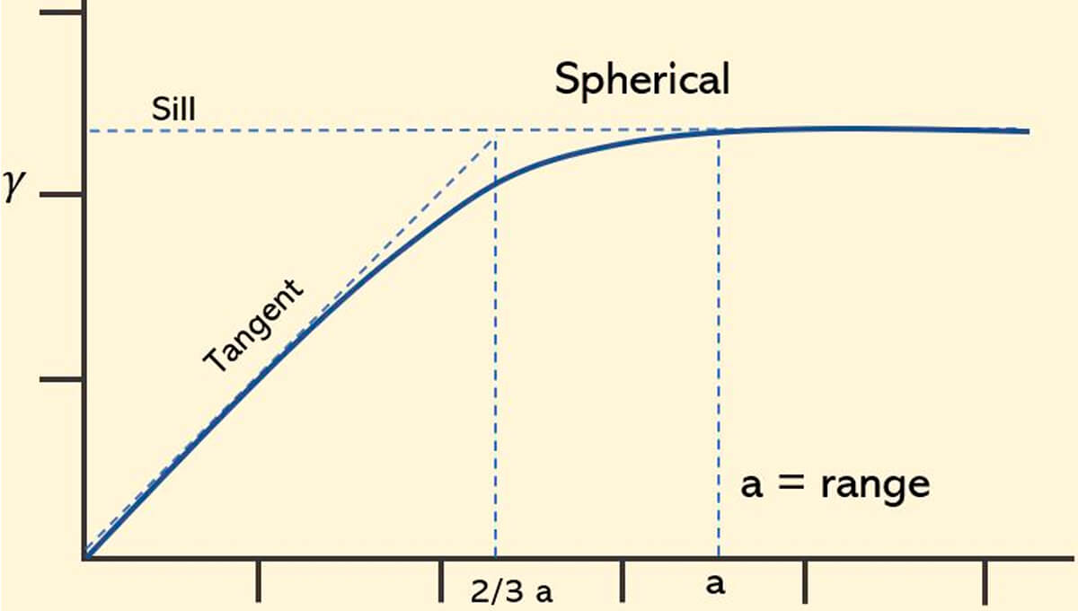
Equation for spherical model:

Exponential variogram model – This model, shown in Figure 32, has the origin at 0, and increases until it nearly levels off. Because it is an exponential function it never levels off. In this case we have a practical range, where you reach 95% of the sill. It doesn’t actually touch the sill, rather with the exception of sample variance and data noise, it only approaches it asymptotically.
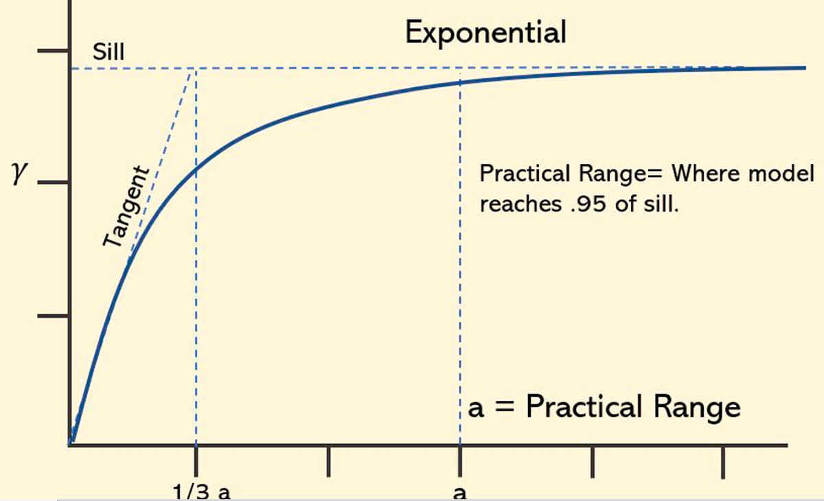
Equation for exponential model:

Gaussian variogram model – The Gaussian model (Fig. 33) increases more slowly near the origin, indicating stronger spatial continuity over short lag distances, and like the other models has practical range. The gaussian model is used for very continuous physical phenomena.
Again, this is a reminder that a good place to start when deciding to fit a model is looking at the behavior of the data close to the origin.
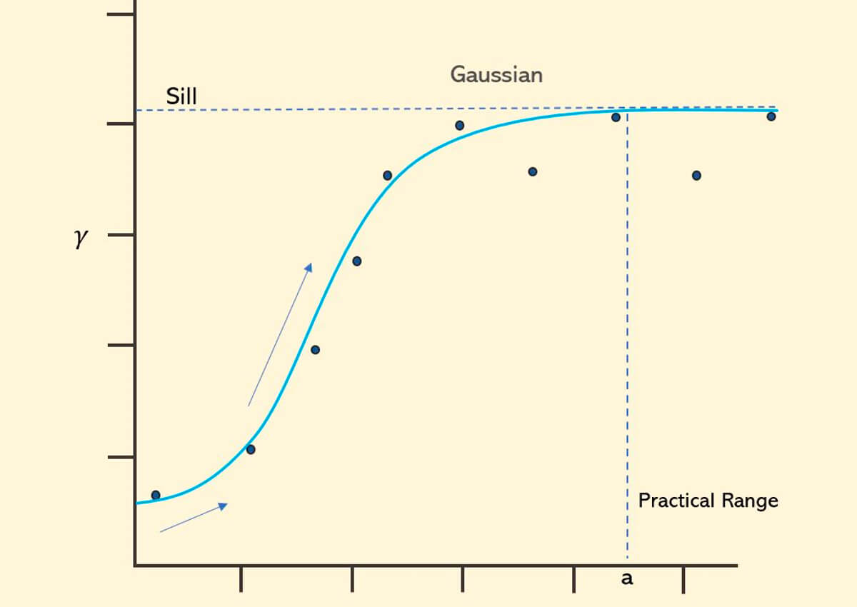
Equation for gaussian model:

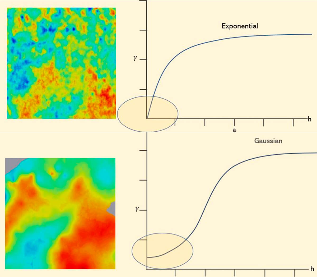
The behavior of your variogram model should capture the smoothness or roughness of the measured data and therefore also inform us about the smoothness and roughness of our modeled data. Looking at the images in Figure 34, it makes intuitive sense as the rough image shows a texture of more rapid change (Exponential), while the smooth image (Gaussian) does not. Your geological expertise, in conjunction with the measured data, should inform these models.
A Cautionary Example
The recent history of the North American upstream has been characterized by the transition to a manufacturing model of production to exploit tight oil reserves. A paper released in 2017, “Spatial variability of tight oil well productivity and the impact of applying new completions technology and techniques” (Montgomery & O’Sullivan 2017), took a close look at the statistical models being used to estimate the driving forces of increased well productivity.
While it is only one study in one basin, the study suggested that simplistic and early assumptions regarding the importance and scale of reservoir properties were incorrect. In particular, models used by the Energy Information Agency (EIA), tended to overestimate the contribution of technology by a significant margin. These models were not only incorrect but tended to be widely accepted and distributed to industry participants, heavily influencing perceptions about the industry’s future production potential. The models undoubtedly influenced the movement of limited capital into unproductive ends, and greatly undervalued the importance of the proper understanding of extensive geological factors that affect reservoir quality and thus well design and location.
The baseline assumptions were that technology was a driving force in the increase in well productivity, and that an effective strategy was to increase reservoir exposure along the wellbore through drilling longer laterals, in turn increasing the amount of fluid and proppant sand used to stimulate a larger volume of rock. The other major factor to consider is the concept of “sweet spotting” or “high grading”. This refers to the practice of focusing drilling activities in areas where the known favorable geological factors are expected to be present by the operators.
One of the most influential models for modeling future productivity was the FE (Fig. 35) regression model which was the used by the EIA for the production forecast incorporated into their models. The model included a location control for their models along with technical factors. However, these location controls were distributed to fixed effect regions. With regards to the FE models, these regions were on the county level, which means that the model controlled for spatial heterogeneity of reservoir quality on the scale of counties which are on the scale of tens of km.
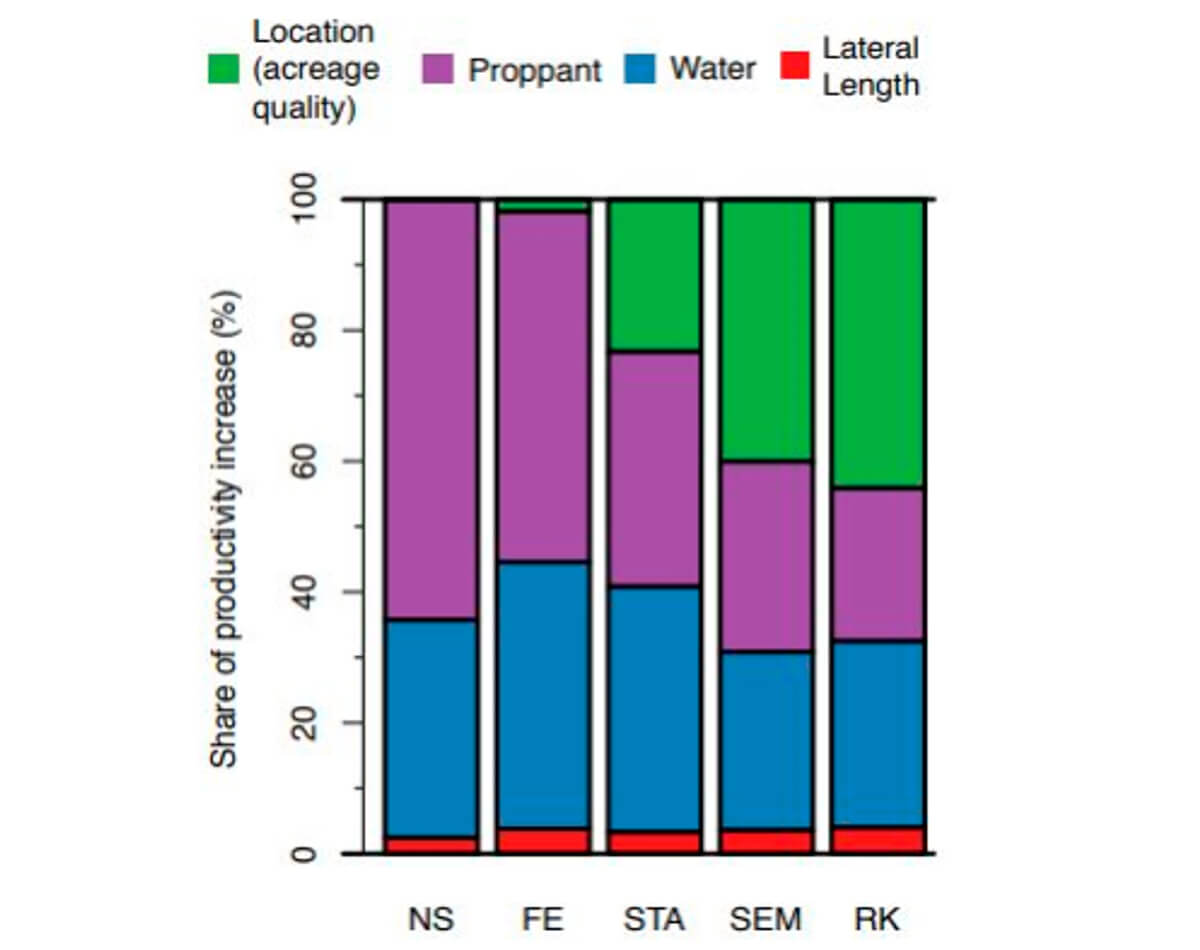
These county level models consequently assumed homogeneity of the reservoir rock within the boundaries of the county by calculating the mean production for the cluster of wells within the county for a particular targeted reservoir formation. Deviations from this mean were therefore attributed to the technology parameters in the model such as lateral length, water volume, or proppant mass.
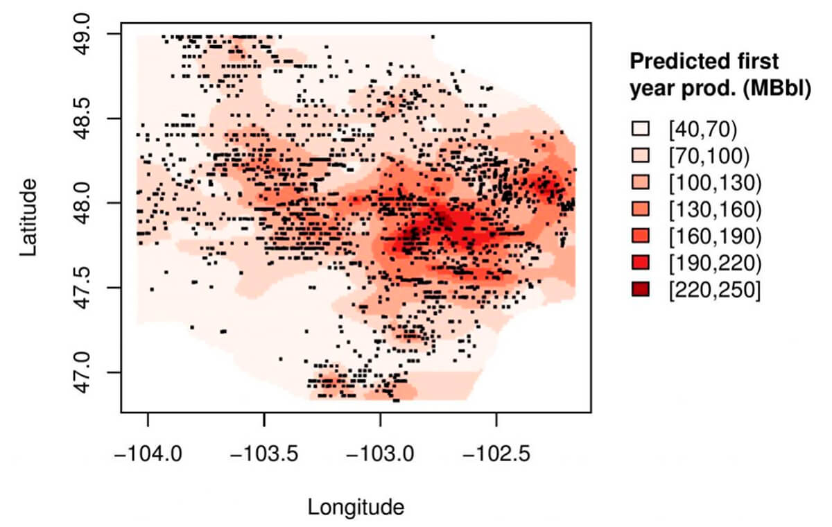
Of note is that the researchers highlight how these models were insufficient in capturing spatial dependency and continuity of the lithology derived from well data. They further suggested approaches that, at this point, should be passingly familiar, using models that capture spatial variation though data kriging (Fig. 36). Briefly contrast this map to our fictional one in Figure 24; the usefulness of capturing and visualizing spatial dependency should start to emerge.
Using models employing these techniques more suited to capturing spatial continuity of the data, would have incorporated higher resolution modeling of the spatial dependency of geological factors, and possibly concluded, as the industry has recently, that increases in productivity have been at least as dependent on high grading drilling locations based on known favorable reservoir properties, as they have been on technological improvements.
Conclusion
Thanks for getting this far!
If you were able to follow along, I hope that you can take away some of these simple points to build off of.
- The heterogeneity of geological processes does not mean estimations of variables of interest are not possible.
- Basic mathematical tools can help you organize the data in a way where simple trends related to spatial continuity can be noticed (Figs. 7-12).
- Correlative relationships between randomly spaced data points can be established and provide useful information regarding the nature of the spatial variance inherent in your study area.
- That a semivariogram constructed from random data can not only provide a visual tool for understanding spatial relationships of sampled data (Fig. 21), but also form the basis of a model used to confidently make estimations in areas where you may not have the sampled data.
- Even big players such as the EIA, fail to appreciate the importance of spatial heterogeneity.
The semivariogram may be an entry level geostatistical concept, however understanding how a data set can construct one is an essential step to broadening one's understanding of all the tools available to a petroleum geoscientist when it comes to understanding the spatial complexity of our data.
Being able to understand and visualize heterogeneity of rock properties and spatial uncertainty is a crossover skill that can aid any geoscientist in their career. What often is intuitive and comes naturally to us geoscientists can be hard to grasp for many people with whom we need to communicate. It is essential that our data visualization and communication skills continue to improve, become second nature, so that everyone can benefit from our discipline and inherent curiosity.
I look forward to feedback so we can continue to update and expand on this document so that it is a quick reference for everyone in need of that first step into understanding the semivariogram and spatial continuity.

Acknowledgements
I would like to thank, Brain Schlute for providing me with the motivation to put this together, the CSEG editors for their patience and effort in helping me with the edits.
Related Reading


Join the Conversation
Interested in starting, or contributing to a conversation about an article or issue of the RECORDER? Join our CSEG LinkedIn Group.
Share This Article