The most powerful tool in any interpreter’s visualization toolkit is memory
What makes visualization such a powerful enabler of human memory is its ability to enhance visual patterns from the data in 3D space, enable recognition, organization and classification of meaningful geological patterns and allow the direct inference of depositional environments.
In the same way in which viewing a meandering channel system during an airline flight may trigger a memory of a channel play, having access to the full set of visual cues is our most potent trigger to memory.
3D visualization enhances our ability to build the reservoir model in our brain similar to the way a field trip to the Rockies may help put the structural complexity of a foothills play in context.
Visualization is used to enable cognitive processes of recognition, organization and classification
We exist in a 3D world. In traditional analysis, maps are often our best approximation, but when we visualize an object in our mind, we do not have to build a contour map to understand it.
Much information is lost or distorted when 3D objects are presented in 2D space. Some examples of this include size, perspective, context and aspect. What is underneath or beside an area of interest is often as important as what is on top.
Human memory has its own limitations, such as the amount of information we can visually process at any one time. Therefore, we require tools to assist us in developing a context to analyse data. With industry data sets now growing in excess of 100GB, these limitations are becoming more pertinent.
The evolution of visualization
Much of the workflow of modern interpretation systems has adopted a method of interpretation that was inherited from the days of paper seismic sections and coloured pencils.
With all the glories of the coloured pencil technique, it did have its limitations, such as the amount of paper one could put down the hallway, or the amount of time that could be spent with an ear to the seismic looking down the section before your exploration manager started to wonder if you heard anything.
When the workstation first arrived, the RAM was limited (64KB), CPU’s were slow (50Mhz), the disk was small (100MB) and graphics cards had no concept of 3D geometry. Computerized versions of conventional paper workflows fit very well into these constraints.
Even with all the limitations of the workstation, you could still fit more seismic onto disk than down the hallway. There were significant improvements in mapping and analysis, but the basic method of detailed picking, followed by integration and mapping to build the reservoir model, was firmly entrenched in the workflow. Data was small, plays were big, and time was short, but it all seemed to fit.
The first workflows introduced into seismic visualization, again, mimicked this picking method. Many interpreters who first tried visualization commented that it was just like picking on a 2D section in 3D space, and they were right. Some could not see the advantages and returned to the conventional methods, but some persevered.
With the increasing popularity and increased resolution of 3D seismic, volume visualization made its debut. This technique turned traditional workflows upside down with the simple idea that the reservoir model existed in the 3D data. All the interpreter had to do was design opacity filters to reveal it. Significant reductions in cycle time and an increased ability to resolve subtle details led to a growth in visualization.
This type of visualization required a change in perspective for the traditional interpreter. Instead of starting from a small amount of information and a large amount of analysis to build a model of the reservoir, the interpreter started with a large amount of information, which was then filtered to enable the reservoir to be revealed. Then this set of filters was used to predict new reservoirs through further empirical observation and refinement through analysis.
Visualization today
Today, interpreters find themselves having to apply more advanced techniques and science to resolve the reservoir. Plays, which reveal themselves by a character change in a fraction of the wavelet, require detailed analysis. Often multiple attributes and associated expert scientists are required to describe these fractional changes.
At the same time, there have been improvements in data acquisition and data processing, which have helped to preserve amplitudes and frequency as well as minimize the effects of noise. There have also been improvements in the understanding of the relationship of physical rock parameters to acoustic attributes. This has increased our ability to model attributes and predict their usefulness. As the number and size of the data types and the subtlety of the remaining reservoirs have grown, so too have the tools and the science to do detailed analysis on large amounts of data.
Classification based on empirical correlations to geologic and petrophysical information and the promise of integration have brought even more data into the system. Amplitudes alone don’t tell the whole picture, and a logical solution is to utilize multiple attributes and disciplines in the visualization. The goal being to find a set of attributes and filters which uniquely describe the reservoir for a certain area in a repeatable fashion.
The opportunity to draw from the collective experience of experts in various disciplines offers the promise of even shorter cycle times and a more complete understanding of the reservoir. With collaboration, the realm of visualization has expanded from reservoir problems to exploration problems.
Today, data is big, plays are subtle but time is still in short supply. Currently, desktop workstations have RAM capacity up to 8GB, CPU’s from 1-2.5Ghz, disk capacity as large as 1TB, and 3D graphics engines that will render at 10’s of millions of voxels and triangles per second. We now find our industry poised to bring the power of visualization to the desktop. The workflows that follow recognize these opportunities and limitations and try to build on the shoulders of what has come before.
The need for speed
Terms such as short-term memory and attention span imply our cognitive capabilities have limits. One of the most important factors in the visualization process is the capability for instant gratification. It fuels the creative process, enables collaboration, and saves you time. Unfortunately, visualization is wrought with compromise among factors such as data sizes, quality, cost, technological limits and time.
Workflow and application performance are based on a combination of disk/network speed, graphics speed, bus speed, CPU speed and RAM. Traditionally disk speeds have been the largest bottleneck. The partial answer to this problem is to use RAM wherever possible. Similar to limitations in human memory, the amount of RAM that is available in today's computers is now one of the largest bottlenecks to interpretation of today’s data volumes.
Recently, data access advancements such as those in fiber optic disk/network controllers and disk array performance have increased data access from 10’s of MB/s to 100’s of MB/s. Additionally, the price of disk has dropped dramatically. With the potential for more than a ten-fold improvement in data access speeds, disk access now holds one of the biggest potentials for increasing total workflow performance. (Fig. 1)
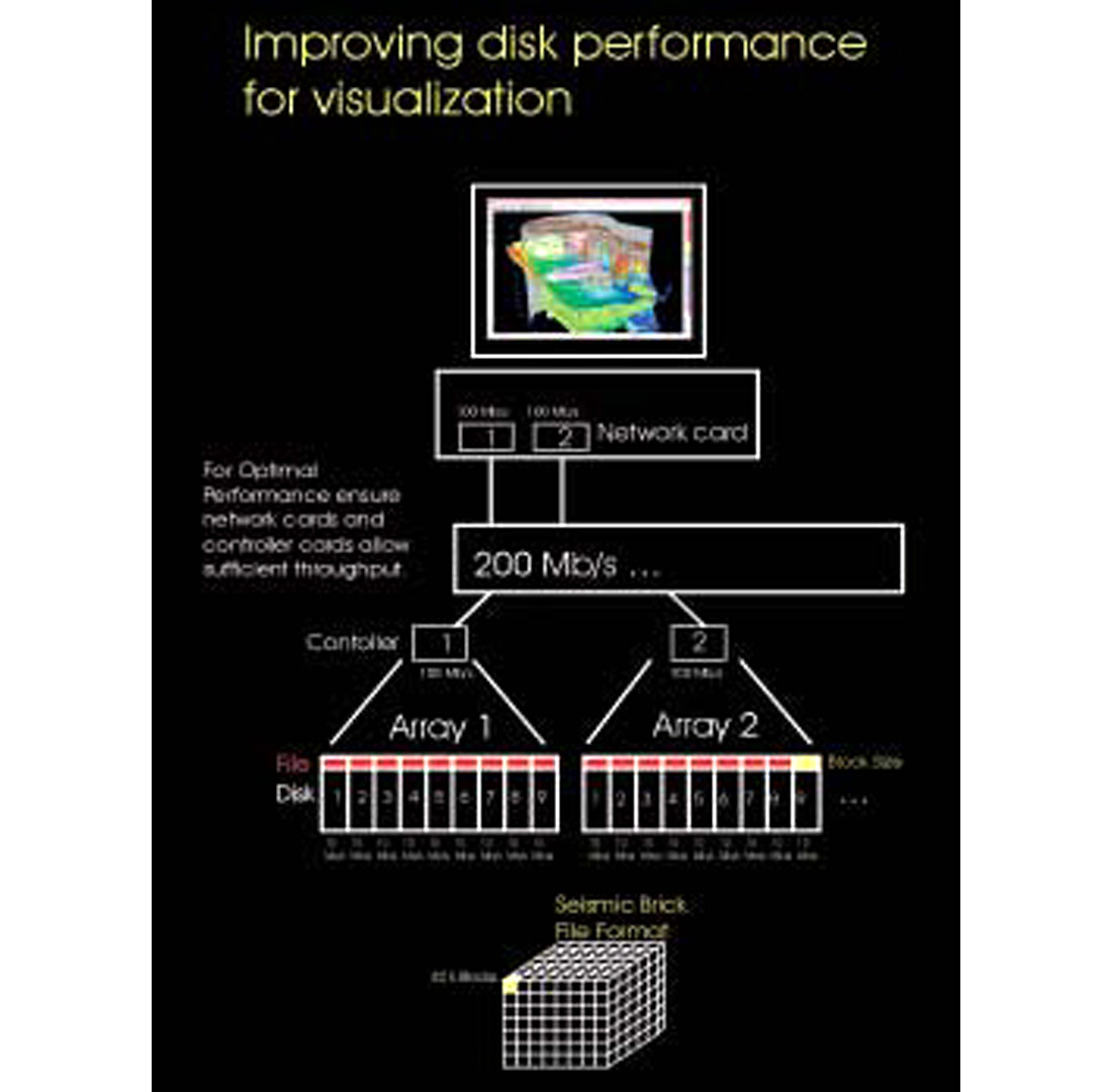
Further increases in application performance can be gained by tuning of the disk according to the type of data. Large 3D seismic may require disks to be formatted with large block sizes and RAID configurations to be optimized for sequential access. Other types of data, such as seismic brick file formats, interpretation and well data, will have different requirements for optimal performance. The challenge is to balance these performance requirements. Applications can further enhance the performance through parallelization of disk access to take advantage of multiple disk heads.
Data format can also help improve performance. Traditional ordering of seismic by a single (fast) axis (ie. time slice) has been replaced with a bricked ordering, which allows equal access to each axis.
Again, by leveraging the speed of RAM, new applications are able to access data from disk and cache it to RAM in real time. This gives the interpreter fast access to 100’s of GB of data within a limited size of RAM. This can be accomplished at disk transfer speeds as low as 20 Mb/s. “Volume roaming” is one example of a workflow which utilizes these latest advantages to overcome RAM limitations.
It’s a matter of perspective
So where do we begin?
Do we start with a micro-interpretation perspective with a small amount of information and add to it? (ie. from detailed picking to mapping and correlation.)
Do we take a macro-interpretation perspective, start with a large amount information and filter? (ie. a workflow of reconnaissance, filtering, isolation, analysis and prediction.)
Alternatively, perhaps there is a method that synthesizes both approaches. A feedback process between microanalysis and macro filters could be used to enable the scientific process to converge on a solution, resulting in a reduction in cycle times.
Why the macro approach?
The process of revealing in-situ geomorphology, isolating meaningful empirical, statistical or geologic facies correlations over the area of interest and then performing detailed analysis has many advantages.
It offers the ability to start with minimum criteria, like size, structure, risk, connectivity, correlation to geologic facies type, in order to detect or have the ability to resolve the reservoir. This way less time will be spent analyzing uneconomical plays or data, which cannot resolve the exploration problem. It enables collaboration among and better use of experts at decision points. It also allows for quick ranking and prioritization of prospects. It is not biased by horizon picking; the data reveals the reservoir. In general, this approach provides the ability to quickly analyze a large number of attributes and data types, and to isolate those, which have the best correlations to reservoir indicators.
When you develop a big picture view first, it may provide an understanding of where detailed analysis will have a better chance of success. Sometimes, if the model is well understood, cycle time can be reduced by jumping right to correlations.
The disadvantage is that it may be difficult to know which attributes will uniquely define the reservoir without detailed analysis. Filtering may not be able to limit the amount of data to quantity that cognitive abilities can handle. The filter may also cause a loss of useful information. If an attribute is expensive or difficult to generate, modeling its usefulness may need to precede empirical analysis.
In general, quick correlation and characterization of data is a good start, but it should always be augmented by asking what this means in terms of the reservoir.
Why the micro approach?
Why the micro approach? The micro approach is very useful for explaining and verifying empirical observations. It enables the interpreter to isolate the most sensitive, or significant attributes. It is also useful in determining parameters and attributes required for a unique solution. Risk and sensitivity analysis can be run for marginally ambiguous solutions. Microanalysis allows you to spend less time analyzing vague reservoir indicators.
However, a lot of time may be consumed model building and analyzing uneconomical plays when prioritization is done at the micro level. The disadvantage of simple horizon based analysis (simply picking of peaks and troughs) is that it may not adequately reflect reservoir heterogeneity (gas effects, porosity effects, lithology changes). Additionally, it is not as fast as filtering techniques.
A Synthesis
By combining the advantages of these two approaches in a visualization environment, we can achieve a synthesis that solves exploration problems faster. The use of visual based empirical techniques backed up by model-based analysis may be used to reduce cycle time and increase accuracy.
Visualization, an example from the Atlantic margin
The objective: rank and delineate prospects in a complex structural dataset in excess of 20GB at 8 bit. The following is an example of a visualization workflow consisting of regional reconnaissance, followed by ranking and problem definition, analysis, prediction, and feeding the analysis back into a regional model.
Regional reconnaissance
Due to hardware limitations, the high-end workstation only has access to 8GB of RAM; thus, a decision on decimation must be made. From a study of the effects of decimation, where data is decimated only in the x and y direction, there seems to be little effect on the ability to detect the prospect based on the time slice view. (Fig. 2) Unfortunately, the resolution on the inline view shows dramatic reduction in ability to resolve the prospect. There is a loss of ability to discriminate fluid contacts and structural detail. From this analysis, it is clear that a decimation of one or two is sufficient for structural framework analysis, but detailed amplitude analysis will require a full resolution volume.
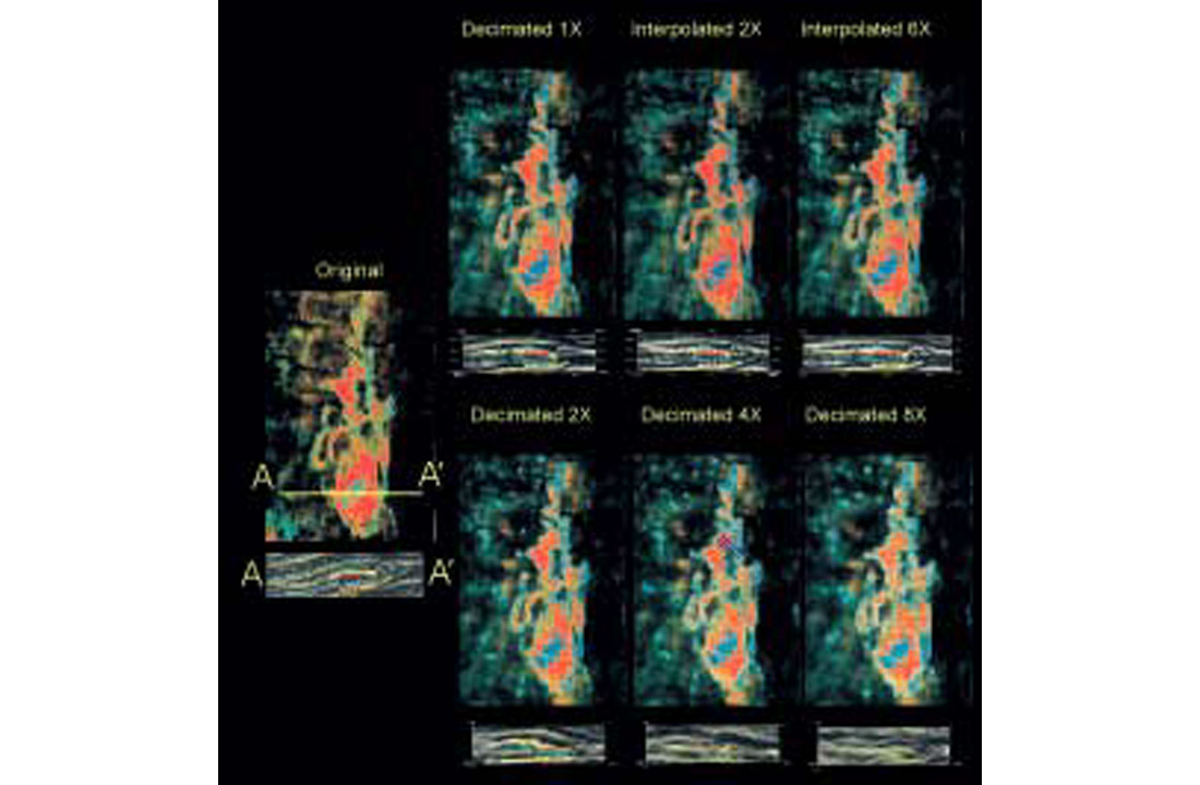
Other notes from the study included the observation that the aspect ratio must change with decimation and it is possible to recover some detail via interpolation.
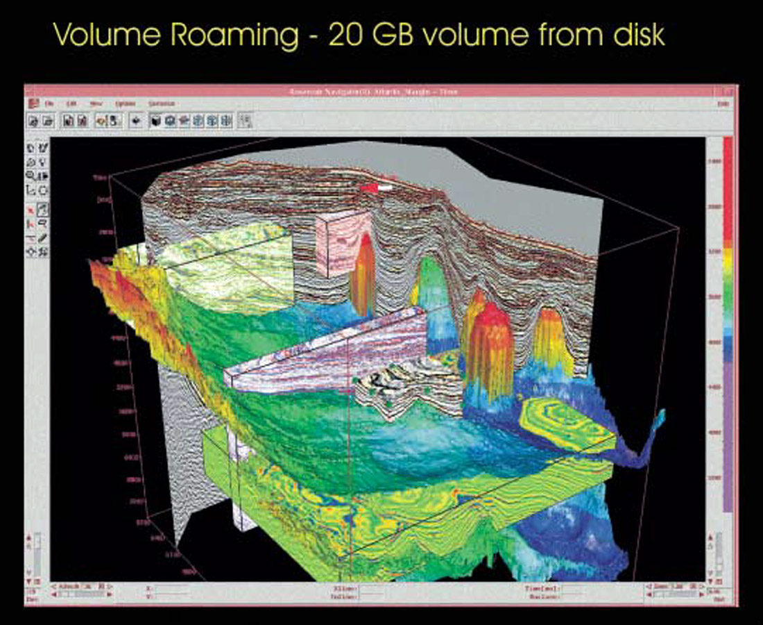
A new solution: Volume Roaming
One solution to the decimation problems is to use the power of the disk and volume roaming to give immediate access to original data. A minimal amount of memory can be used for reconnaissance as the data bricks are read from disk to memory.
The bricked volume format uses a compressed data header, which allows fast access for previewing, and a single toggle that brings full precision data into view. It also helps organize the analysis of decimated and original data as well as other attribute datasets together to assist in multi-volume correlation. The areas of interest are defined and block positions are saved for detailed analysis later. Alternatively, the blocks can be immediately analyzed with volume visualization. Final interpretation can be integrated with the full original volume. (Fig 3.)
Thinking inside the box
Most of the important information lies inside the box. The basic tools to reveal the reservoir are simple yet powerful.
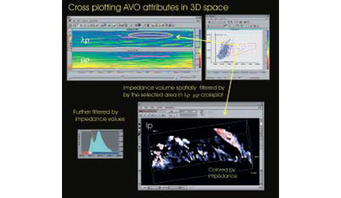
Spatial opacity adjustment is achieved by changing the degree of transparency to reveal the desired attributes. A filter can be based on the attribute range, the rate of change of the attribute, the desired area in a cross-plot relationship, or a simple sculpting between time slices or horizons and faults.
Classification is achieved via colour, colour augmented by illumination, by reassigning or detecting of voxel values, picking, the reassigning of picks, and visual correlation of all of the above.
The power comes when these tools and workflows are combined with memory and the natural ability of the mind to understand the 3D space. (Fig. 4)
Volume analysis of blocks
Returning to our example, during volume roaming we find several indications of channels. There are several analysis options available for events that are steeply dipping. (Fig. 5)
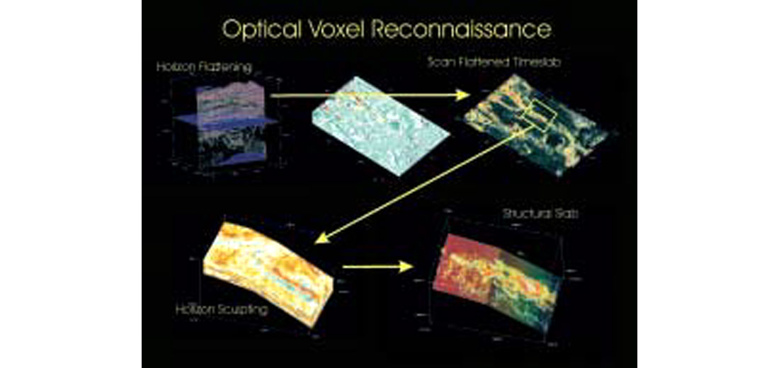
Option 1: Flattening on a Regional Dip
For reconnaissance, flattening on a simple surface that follows the dip, works well. The idea is to enable an event to fit within a time slab of data, with no need to pick an actual event. The next step is to design an opacity filter that reveals the geomorphology. A trimmed volume can then be used to roam the filter up and down through the volume to note potential targets (Fig. 5)
Option 2: Sculpting
For sculpting, the first step is to pick a simple surface, which reflects the regional dip for both the top and bottom of a sequence. Next, isolate the voxels between the two surfaces. Design an opacity filter as before, and shift the sequence up and down to reveal other events. This method maintains structural information and is better for estimating fluid contacts (Fig. 5)
Option 3: Subvolume Detection
Subvolume detection is a filter based on the connectivity within attribute ranges. Significant events can be selected from seed points or through a multi-body detection within the volume. Subvolumes can be analyzed for correlation to geologic events or attribute values. The resultant geobodies can be filtered based on a histogram of sizes.
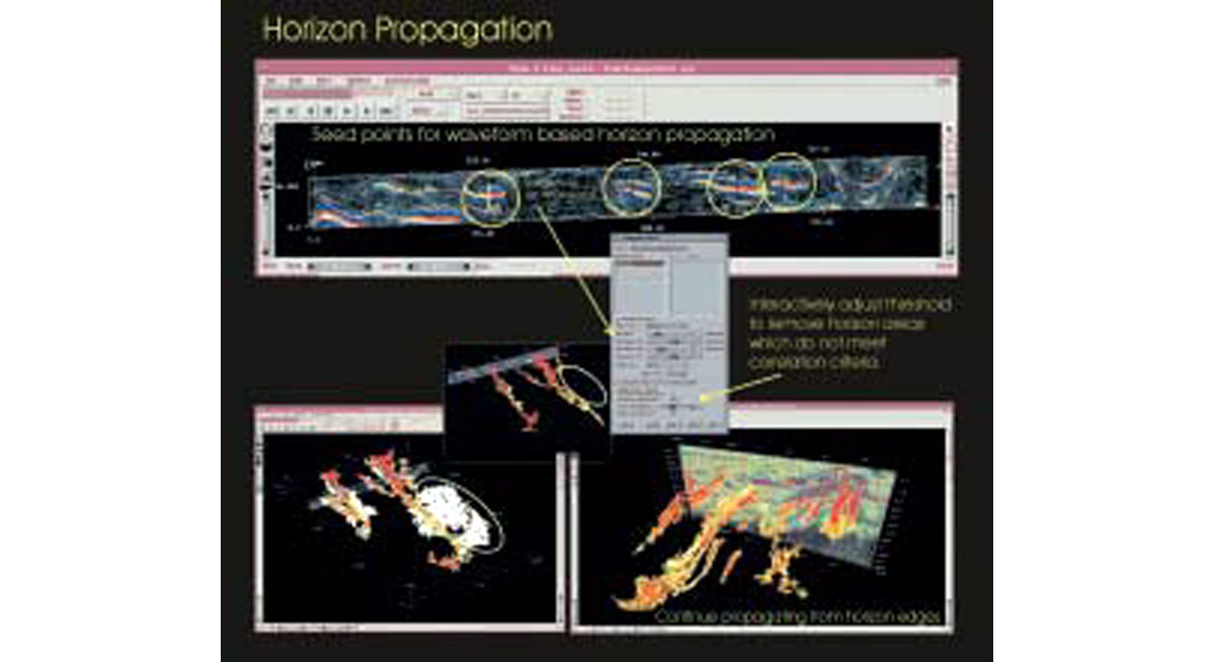
Option 4: Waveform Correlation
Waveform based horizon correlation entails choosing seed points or picks on potentially interesting events. First, a waveform gate over which to correlate and pick the data is defined. After the data is picked, the correlation threshold value may be interactively adjusted to trim the horizon extents so that it better corresponds with geologic facies or attribute values. (Fig. 6)
Option 5: Conventional Analysis
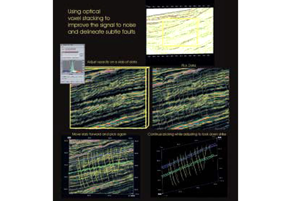
Conventional picking and analysis with opacity filtering has the advantage of utilizing enhanced signal to noise ratios. Being able to guide your picking in a semi-transparent environment allows the interpreter to develop a consistent structural framework with instant access to inline, crossline, and timeslice. It provides the ability to correlate events along structural strike and dip through a slab of data. Another advantage is the ability to pick in true 3D space on any voxel that has an opacity of 75% or more. (Fig. 7)
Note: These methods work well in non-structural areas too.
Enhancing spatial relationships
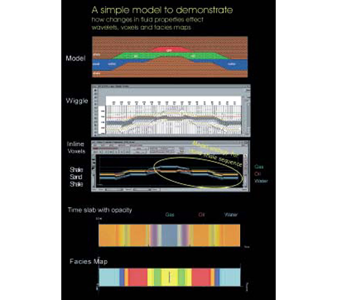
What does a doublet look like in voxels from a time slab perspective? What does it mean in terms of the reservoir? When transparency is used to blend colours, what does it mean? What is the optimal filter to reveal the reservoir properties? When you are new to visualization, these answers are not always apparent. Modeling is a good tool to validate and explain what you see in 3D space. (Fig 8.)
Think about the result
What is required to make a decision?
Having isolated an interesting seismic facies, it is good to take a step back and think of the problems that need to be solved to delineate the prospect. Is there a seal? How do I know what is in the reservoir? What was the depositional environment? How do I minimize my risk? Is my data quality sufficient?
In this example, we have isolated a bright reflector that from optical voxel stacking seems to indicate a structural trap developed by a crosscutting channel.
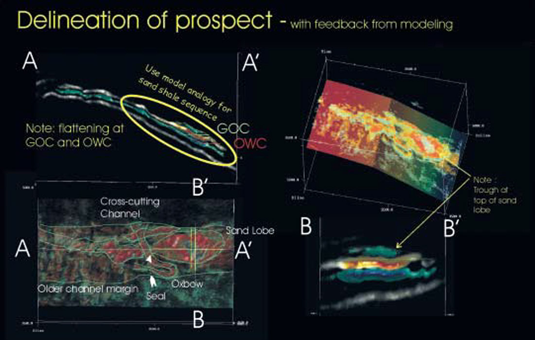
Notice the trough at the top of the sand lobe. What does that mean in terms of the reservoir? (Fig 9.)
Now memory kicks in, you remember a simple structural petroacoustic model of a gas sand. (Fig 8.) The top of the sand went from a peak through the hydrocarbon zone to a trough through the gas zone. Could that be what is happening here? On further investigation, you see flattening that can be associated with gas oil contacts (GOC) and oil water contact (OWC) in the structural slab. The model is coming together. A quick volumetric analysis over the gas and oil zones reveals there is a volume of 4x10⁷ M3. Factor in the porosity and recovery factor. Yes, we can chase this one.
Not bad for a couple of hours work. Now let’s bring the rest of the experts in and see if this prospect holds up under closer inspection.
Enabling the collaborative process
As a powerful enabler of memory, visualization has helped you to quickly delineate a prospect. Now imagine what you can do with the combined experience of a group of experts.
Let the model speak for itself and add the perspectives of other disciplines, geology, petrophysics and drilling. The refined filters and play concepts can be applied to other areas for verification and prospect generation.
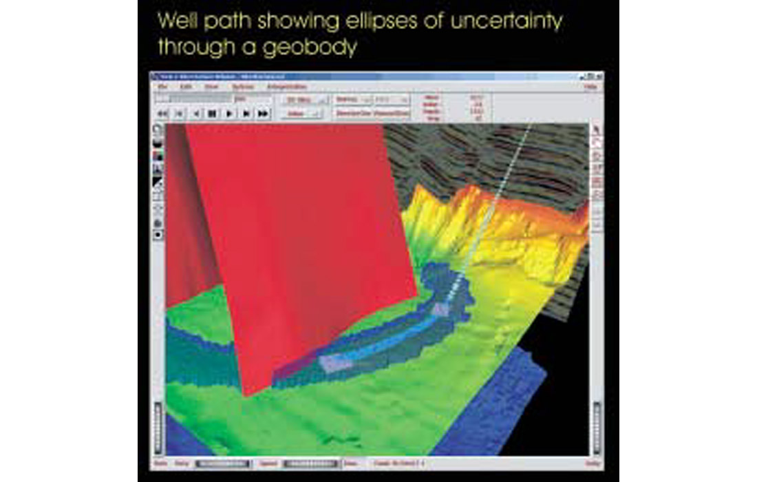
As you enter the final stages of planning the well, the drilling engineer expresses concerns about a drilling problem on the last well. Filtering on the tops associated with drilling problems in your database, you realize they are associated with a certain fault. This fault is subtle and only resolvable via optical voxel stacking. Normally, this fault would not be picked, as it does not control the structural trap. However, in this case it is picked, and a well is planned to avoid the fault while taking into account the positional uncertainty and feasibility based on torque and drag calculations. Now exploration problems are being solved and the expertise and needs of other disciplines are being leveraged. (Fig. 10)
Once more outside the box
Often visualization is limited in scope and the advantage of the collective experience may be lost. Collaboration is often easier than becoming a renaissance explorationist.
Traditional perspectives and wisdom need to be translated to a new generation. This is one of the largest opportunities provided by visualization, the leveraging of the collective memory and wisdom. Often the experienced explorationist who is able to embrace the new technology will find the greatest rewards.
Education is the key. There are some great courses in visualization that are designed to introduce visualization techniques, show the value of the workflows and to explore the advanced concepts of visualization.

Acknowledgements
Thanks to all my colleagues at Paradigm Geophysical for their assistance.


Join the Conversation
Interested in starting, or contributing to a conversation about an article or issue of the RECORDER? Join our CSEG LinkedIn Group.
Share This Article